Restaurant Review App
Enhancing the Feedback System for a Restaurant Review App
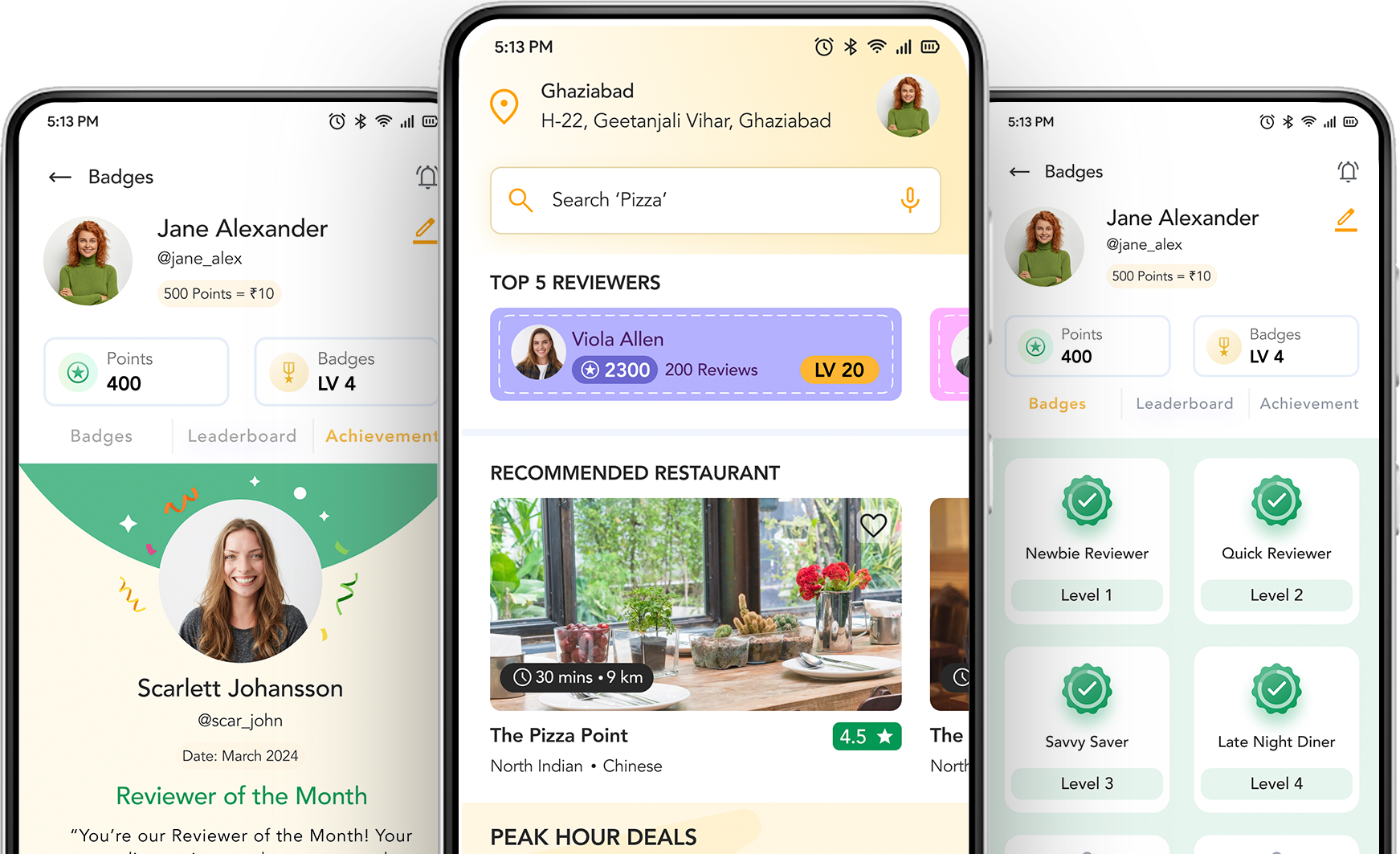
Project Overview
Project Scope
Enhancing the Feedback System for a Restaurant Review App
Tools
Figma, Photoshop, Invision
Role
UX Designer (User Research, Visual design, Interection design, Usability testing)
Duration
1 Weeks (40 Hours)
Project Background
Restaurant review apps are vital for users seeking recommendations and reliable information about dining options. However, the effectiveness of these apps depends on user-generated content. Despite having a large user base, our app experiences low participation in the feedback process. Users have reported that the current system is difficult to navigate, leading to incomplete reviews or no reviews at all. This lack of detailed feedback diminishes the app's value for other users and impacts overall user satisfaction.
Problem Statement
The current feedback system in the restaurant review app is cumbersome and not user-friendly, resulting in low user engagement and fewer detailed reviews. Users find the process of leaving reviews complex and time-consuming, leading to frustration and high abandonment rates.
Goal Statement
Design an intuitive, user-friendly feedback interface that streamlines the review process, encourages detailed feedback, and increases user engagement on the restaurant review app.
Design Process
Empathize
- Research
- Empathy Map
- Persona
- User Story
- User Journey
Define
- Pain Points
- Problem Statement
- Hypothesis Statement
- Value Proposition
Ideate
- Competitive Audit
- How Might We
- Goal Statement
- Task Flow
- User Flow
- Storyboard
- Paper Wireframe
- Information Architecture
- Digital Wireframe
Prototype & Test
- Lo-Fi Prototype
- Research Plan
- Usability Study
- Synthezise Insights
- Make Changes according to Insights
EmpathizeResearch
Research deepens my understanding of users' frustrations, hopes, fears, abilities, limitations, reasoning, and goals, forming the foundation for effective solutions. To ensure focused and structured research, I create a detailed research plan before the research phase, Problem statement, outlining goals, participants, and timelines to guide app design.
UX Research consent form
Prior written consent is required to record an interview, so be sure to attach a consent form to the email. If the participant is a minor or unable to consent under applicable law, then written consent is required from the participant's parent or guardian.
UX Research consent form
Research Goals
- Identify the main challenges and frustrations users face with the current feedback system.
- Conduct a market analysis to identify current trends, key competitors, and best practices in feedback systems used by other restaurant review apps.
- Discover what additional features users would like to see in the feedback system to improve their experience.
- Understand how users would like to customize their feedback (e.g., rating categories, text fields, photo uploads).
Assumptions
- Food lovers are the main users of food review platforms
- Users is motivated by discounts and special offers to explore more dining options.
- I value long, detailed reviews because they allow me to capture and share the entirety of my dining experience.
- Users prefers an app with a user-friendly interface and efficient review submission process.
- Users engages with multimedia content, such as photos and videos, to enrich her reviews.
- Users appreciates personalized dining recommendations based on his past activities.
- Users prefers instant and helpful customer support for any issues.
Research Methodology
- Primary Research (User Interview)
User Interviews
Building on a general market and audience understanding, I deepened my engagement to connect with users directly, gathering insights through primary research."
I've crafted an Interview Guide with 10 open-ended questions to enhance user interviews, inviting participants to share their experiences and insights."
We interviewed 10 participants (7 males and 3 females) about their past experiences with enhancing feedback systems for a restaurant review app.
Assumptions Validated
- Food lovers are the main users of food review platforms
Validated. 7/10 participants said they frequently use food review platforms to explore new dining options and to see what others have to say about different restaurants. . - Users is motivated by discounts and special offers to explore more dining options.
Validated. 6/10 participants said I am motivated to explore more dining options when discounts and special offers are available. - I value long, detailed reviews because they allow me to capture and share the entirety of my dining experience.
Not Validated. 7/10 As a user said I may not always value long, detailed reviews. Sometimes, concise and to-the-point reviews are sufficient for capturing and sharing my dining experience. - Users prefers an app with a user-friendly interface and efficient review submission process.
Validated. 4/10 participants said I prefer an app that is easy to navigate and allows me to submit reviews quickly and effortlessly. - Users engages with multimedia content, such as photos and videos, to enrich her reviews.
Validated. 3/10 participants said I engage with multimedia content like photos and videos to enrich my reviews. They help me better illustrate my dining experience and make my reviews more engaging and informative. - People are eager to use digital platforms to plan and organize their dining experiences based on restaurant reviews.
Not Validated. 5/10 As a user said I may not always rely on digital platforms to plan and organize my dining experiences based on restaurant reviews.
EmpathizeEmpathy Map
Based on primary research, I've gathered extensive user data, which I am now synthesizing using an Empathy Map. This process will help us understand user needs and behaviors more deeply, informing the development of our restaurant review app.
Research Synthesis
EmpathizePersona
Based on my research and insights from the Empathy Map, it's time to develop user personas. This will help us create detailed profiles that guide the design and functionality of our restaurant review app. In UX design, a persona is a fictional, representative user created based on research to embody key traits, behaviors, and goals of target users. Personas help designers understand user needs and preferences, guiding design decisions to create more user-centered and effective products.
EmpathizeUser Stories
After creating the personas, I will develop user stories that align with these personas. This will help ensure that the features and functionalities we build are tailored to meet the specific needs and expectations of our target users. User stories in UX design are short descriptions of what a user wants to achieve, helping teams focus on user-centric design and functionality that meets real user needs.
User Story: The Foodie Enthusiasts
- As a foodie enthusiast, I want to receive badges for my detailed reviews so that I feel recognized and motivated to continue contributing.
- As a foodie enthusiast, I want a clear 5-star rating system with descriptive labels so that I can accurately rate different aspects of my dining experience.
- As a foodie enthusiast, I want a feedback form that allows me to add photos and detailed comments without being too lengthy so that I can provide comprehensive reviews efficiently.
- As a foodie enthusiast, I want notifications when someone likes or comments on my review so that I can engage with the community.
User Story: The Busy Professionals
- As a busy professional, I want a simplified feedback process with minimal steps so that I can quickly leave my review without it taking too much time.
- As a busy professional, I want advanced filtering options to sort reviews by relevance and date so that I can easily find the most useful information.
- As a busy professional, I want an intuitive rating system that is easy to understand and use so that I can quickly provide feedback without confusion.
- As a busy professional, I want to save draft reviews so that I can complete them at a later time if interrupted.
User Story: The Community Contributors
- As a community contributor, I want see existing reviews before submitting mine so that I can provide feedback that aligns with the overall sentiment and context.
- As a community contributor, I want receive personalized responses to my reviews so that I feel acknowledged and valued for my contributions.
- As a community contributor, I want upload photos and videos along with my reviews so that I can give a more detailed and vivid account of my dining experience.
- As a community contributor, I want to earn points for my reviews that can be redeemed for rewards so that I feel incentivized to contribute more.
- As a community contributor, I want to follow other top reviewers and see their activity so that I can stay engaged with the community.
User Story: The Casual Diners
- As a casual diner, I want a quick and straightforward feedback form with minimal fields so that I can leave my review without spending too much time.
- As a casual diner, I want reviews to be easy to read and filter so that I can quickly find relevant information without feeling overwhelmed.
- As a casual diner, I want a simple rating system that doesn't require extensive input so that I can easily rate my dining experience.
- As a casual diner, I want to leave voice notes instead of typing so that I can provide feedback more conveniently.
EmpathizeJourney Map
Based on my research and insights from the Empathy Map, it's time to develop user Journey Map. This will help us create detailed profiles that guide the design and functionality of our restaurant review app. A journey map is a UX design tool that tracks the user's end-to-end experience with a product or service. It captures Actions, Task list, and feeling responses throughout the interaction. This helps designers understand how users navigate through the product, identify friction points, and improve the overall experience.
DefinePain Points
In UX design, pain points are specific issues or challenges users face while interacting with a product. They can stem from usability, performance, content, design, interaction, emotional response, financial concerns, or support.
DefineProblem Statement
Problem statement clearly defines a specific issue or challenge faced by users. It articulates what the problem is, who it affects, and the impact on their experience. This statement guides the design process by focusing on solving user needs and improving the overall experience.
"User is a dedicated reviewer who needs a streamlined feedback process and improved multimedia upload options because the current complex system and limited features hinder his ability to provide detailed and engaging reviews efficiently."
DefineHypothesis Statement
A hypothesis statement in UX design proposes a testable idea about how a change will affect user behavior. It follows the format: "If we [implement change], then [expected outcome] because [reason]." This helps guide design experiments and measure their impact on user experience.
Problem Statement
"User is a dedicated reviewer who needs a streamlined feedback process and improved multimedia upload options because the current complex system and limited features hinder his ability to provide detailed and engaging reviews efficiently."
Hypothesis Statement
"If we simplify the feedback process and enhance multimedia upload options in the Restaurant Review App, then dedicated reviewers like Mohsin Ansari will be able to provide more detailed and engaging reviews efficiently, leading to increased user satisfaction and higher quality content in the app."
DefineValue Proposition
In UX design, a value proposition is a clear statement that explains the unique benefits and value a product or service offers to its users. It addresses why a user should choose that product or service over alternatives and how it solves their specific problems or meets their needs.
IdeateCompetitive Audit
A competitive audit in UX design is a systematic analysis of competitors' products to identify their strengths, weaknesses, and design patterns. This process helps UX designers understand the competitive landscape, uncover opportunities for improvement, and develop strategies to differentiate their own products.
IdeateHow Might We
In UX design, "HMW" stands for "How Might We." It's a phrase used to frame problems or opportunities as open-ended questions to encourage creative thinking and brainstorming. By using "HMW," you can turn specific challenges into opportunities for innovation and explore a wide range of potential solutions.
IdeateGoal Statement
A Goal Statement in UX design clearly defines the main objective of a project, including the desired result, target audience, and criteria for measuring success. This statement guides the design efforts, ensuring alignment with the project's aim and enhancing the overall user experience effectively.
Problem Statement
"User is a dedicated reviewer who needs a streamlined feedback process and improved multimedia upload options because the current complex system and limited features hinder his ability to provide detailed and engaging reviews efficiently."
Goal Statement
"Our Restaurant Review App will let users easily submit detailed reviews through a streamlined feedback process and enhanced multimedia upload options, which will benefit dedicated reviewers by allowing them to create more engaging and comprehensive content efficiently. We will measure effectiveness by tracking the increase in the number and quality of reviews submitted, user satisfaction ratings, and the level of engagement with multimedia content."
IdeateTask Flow
By creating three task flows centered on Restaurant Review App's key features, I aimed to improve user navigation and task completion. This method helped me design effectively and evaluate the user experience.

IdeateUser Flow
In UX design, a user flow is a visual representation of the steps a user takes to achieve a specific goal within an application or website. It maps out the sequence of actions a user needs to follow, from the initial entry point to the completion of the task.

IdeateStoryboard
A storyboard in UX design is a visual tool that tells the story of how a user interacts with a product or service. It's like a comic strip that shows the step-by-step experience of a user. Here's a simple breakdown:
IdeatePaper Wireframe
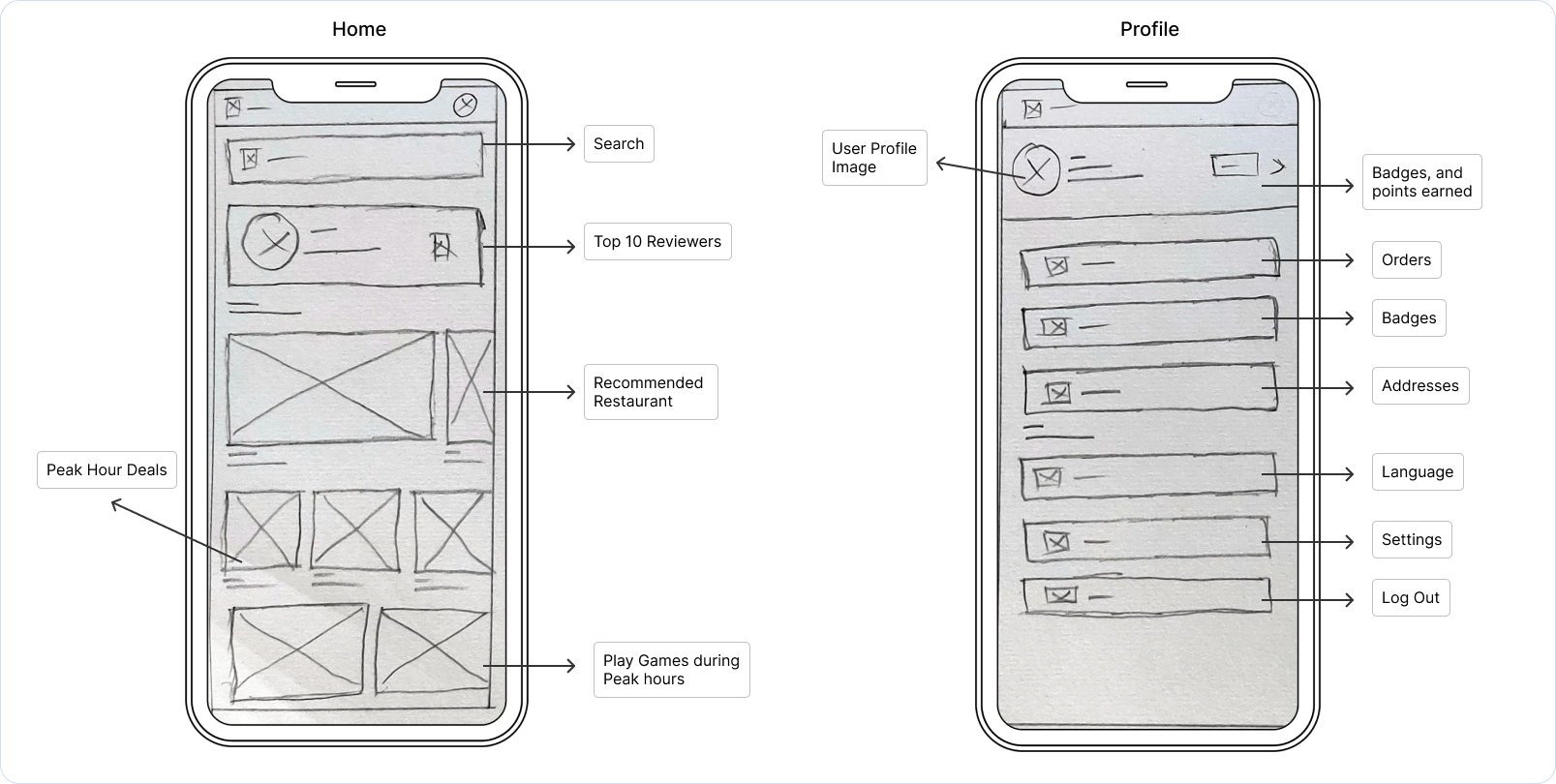
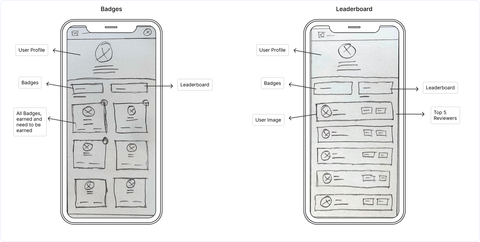
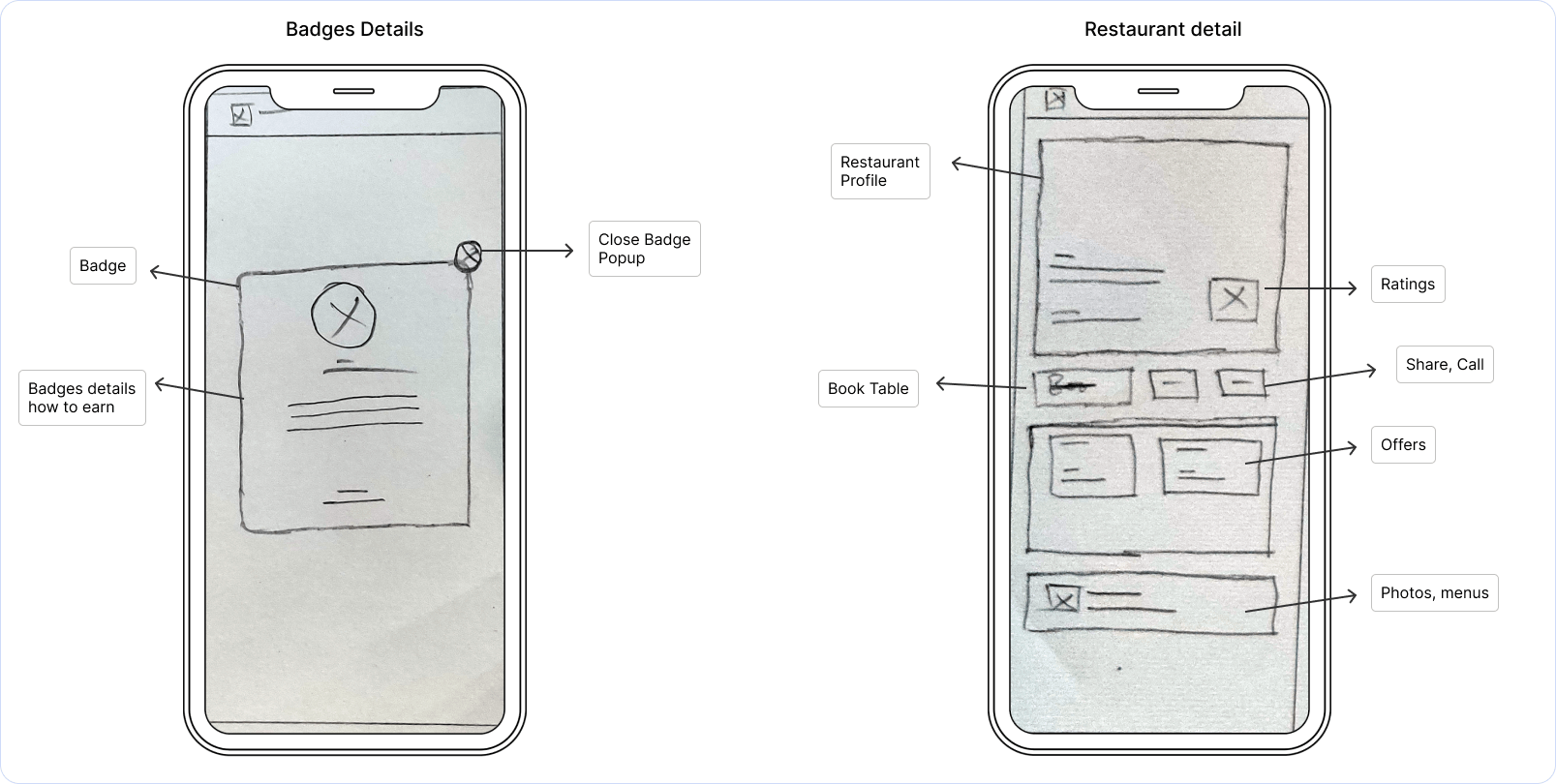
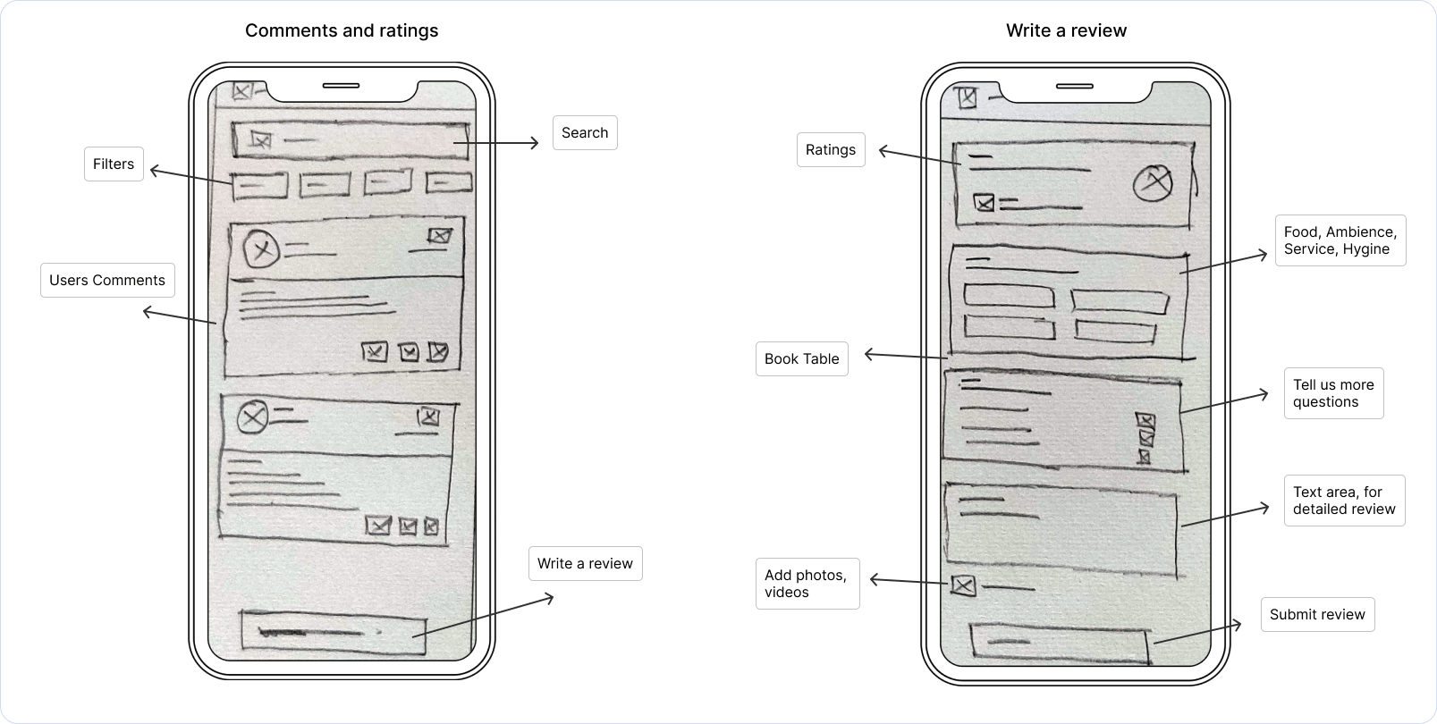
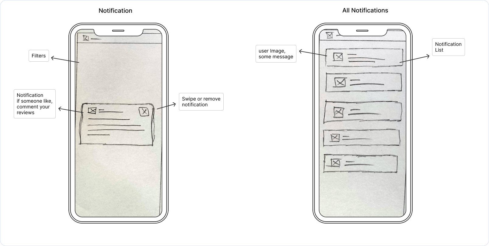
Post-creation of the UI Requirement Document and a corresponding to-do list for the critical screens identified in the task and user flows, I commenced sketching low-fidelity screens. This quick, hand-drawn approach allows me to explore and refine ideas efficiently before the extensive process of digital rendering.
In UX design, a paper wireframe is a hand-drawn sketch that outlines the basic structure and layout of a user interface (UI). It is a low-fidelity representation used in the early stages of the design process to convey ideas and concepts quickly and clearly without focusing on detailed aesthetics or technical elements.
IdeateInformation Architecture
Information Architecture (IA) in UX design is the practice of organizing and structuring content within a digital product to ensure that users can easily find and understand the information they need. It involves creating a clear hierarchy and navigation system, labeling, and categorizing content to enhance usability and improve the overall user experience.
IdeateDigital Wireframe
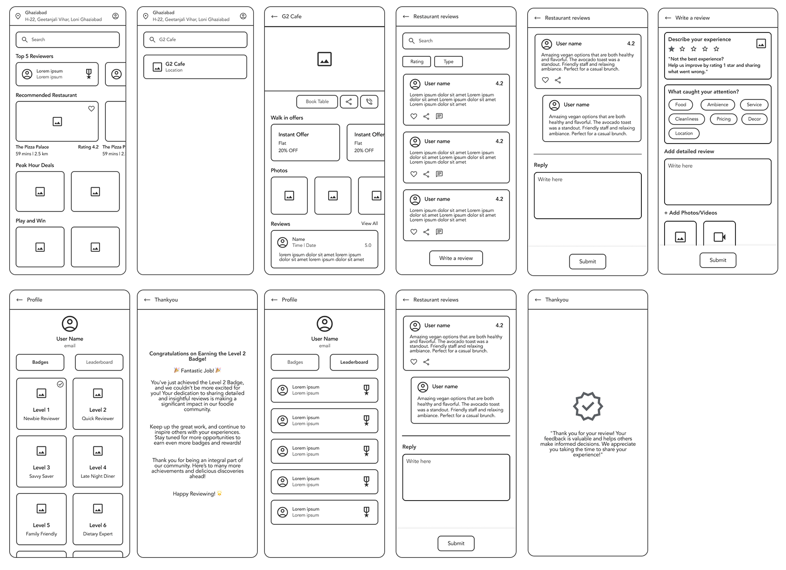
With the visual direction set, I moved on to creating mid-fidelity wireframes to enhance the details and precision of the design. This approach helps maintain visual consistency and hierarchy prior to final styling. I utilized proven design patterns from competitors and incorporated features that directly address user objectives and pain points.
In UX design, a digital wireframe is a visual guide that represents the layout and structure of a user interface. It's a low-fidelity, often grayscale design used to outline the basic elements and functionality of a digital product before adding detailed design elements or high-fidelity visuals.
PrototypeLo-Fi Prototype
Having finalized the essential task screens, I created a Lo-fidelity prototype using Figma to facilitate usability testing. This enables us to detect and address issues with information architecture and user flows before dedicating significant resources to detailed design.
Lo-Fi prototypes are used to quickly sketch out and validate the structure and functionality of a design. They help in testing basic concepts and interactions without investing significant time in detailed design or development.
Prompt - 1
Prompt - 2
Prompt - 3
Prompt - 4
TestUsability Study
Effective usability testing requires a well-defined Research Plan, including test Project background, participant, Stakeholders profiles, chosen methodologies, KPIs, and scripts. To ensure a comprehensive approach, I have created a usability testing plan that details our testing aims, scope, and preparation strategies.
In UX design, a digital wireframe is a visual guide that represents the layout and structure of a user interface. It's a low-fidelity, often grayscale design used to outline the basic elements and functionality of a digital product before adding detailed design elements or high-fidelity visuals.
Conduct Usability Testing
I performed usability testing with five participants, recording note-taking spreadsheet of their mistakes, observations, Quotes and Task Completion. These note-taking spreadsheet are vital for summarizing user interaction patterns with the prototype.
Usability testing is a crucial part of UX design that involves evaluating a product or system by testing it with real users. The main goal is to identify usability issues, gather qualitative and quantitative data, and understand how users interact with the product to improve its design.
Affinity Diagram
An affinity diagram is a tool used in UX design (and other fields) to organize and categorize a large amount of information, ideas, or data based on their natural relationships. It helps teams synthesize complex information and identify patterns, insights, and themes.
Patterns
Insights
Recommendations
- 3/5 users experienced difficulties with the photo upload process.
- Users need clearer instructions regarding photo size limits, and the ability to upload multiple photos at once would significantly improve the user experience.
- Provide clear instructions on photo size limits during the upload process.
- Introduce basic photo editing options, such as cropping and brightness adjustment, before uploading.
- 2/5 users found the text editor limited in formatting options.
- The limited formatting options in the review text editor hinder users from writing detailed and well-structured reviews.
- Enhance the text editor with additional formatting options like bold, italics, and bullet points to improve review clarity and detail.
- 2/5 users had issues with the placement and visibility of the 'Add Review' button.
- The 'Write Review' button and overall navigation could be more intuitive and prominently placed to reduce confusion.
- Relocate and highlight the 'Write Review' button to make it more visible and accessible.
- 2/5 Users expressed a desire for a draft-saving feature for their reviews.
- The ability to save drafts would cater to users who need more time to complete their reviews.
- Introduce a draft-saving feature to allow users to save and return to their reviews later.
- 4/5 users experienced difficulty navigating to the badge section, with some sections (like 'Achievements' or 'Rewards point') being hard to find or not intuitive.
- Users have difficulty finding the badge or achievements section due to poor labeling or navigation paths, affecting the overall user experience.
- Reorganize or better label sections such as 'Achievements' or 'Rewards points' to make them more intuitive and easier to find. Consider adding a direct link to these sections from the profile or home screen.
- 4/5 users found the criteria for earning badges clear but had challenges understanding detailed requirements or finding specific review examples.
- While badge criteria are listed, users often struggle with vague or unclear requirements, making it hard to ensure their reviews meet the criteria.
- Provide clearer and more detailed guidance on badge criteria. Include examples of detailed reviews that align with the criteria to assist users in meeting requirements.
- 2/5 users Writing and submitting reviews that meet badge criteria was generally easy for 5/5 users, though ensuring the review met all requirements could be challenging.
- Despite the challenges in navigation and understanding criteria, users generally find writing and submitting reviews straightforward.
- Streamline the process for accessing badge information to reduce the number of taps required and make it easier for users to find and understand badge requirements.
- 4/5 users found it challenging to understand the criteria for how badges were earned or to get detailed information about badge achievements from the leaderboard.
- Users struggle to find detailed information about how badges are earned, leading to confusion and a lack of understanding about badge achievements.
- Include more details about each badge’s criteria directly on the leaderboard. Add tooltips or expandable sections that provide clear explanations of how each badge was earned.
- 3/5 users noted that the visual representation of badges on the leaderboard was either too small or cluttered, making it difficult to distinguish or compare badges.
- The small size of badge icons and a cluttered layout impact users’ ability to clearly view and compare badges.
- Increase the size of badge icons for better visibility. Redesign the layout to reduce clutter and make it easier to distinguish between different badges.
- 4/5 users expressed a desire for more detailed explanations of how badges were earned and for interactive features to learn more about each badge directly from the leaderboard.
- Users are looking for interactive elements that allow them to learn more about each badge directly from the leaderboard and to filter badges by different categories.
- Implement filtering options that allow users to view badges by category or type. Add features that enable users to compare badge counts among top users more effectively.
- 3/5 users experienced difficulty navigating to detailed badge information or found the process to access detailed criteria involved multiple steps.
- The process to access detailed badge information involves several steps, making it less user-friendly and intuitive.
- Simplify the process to access detailed badge information. Consider adding direct links or shortcuts from the leaderboard to detailed badge descriptions.
- Add interactive elements that allow users to click on badges to learn more about them. Provide options for users to engage with and explore badge-related content directly from the leaderboard.
Branding
Branding in UX design accessibility involves ensuring that all elements of a brand's identity—visuals, tone, interactions, and emotional connections—are accessible to everyone, including people with disabilities. This approach not only adheres to ethical standards but also expands the brand's reach and inclusivity.
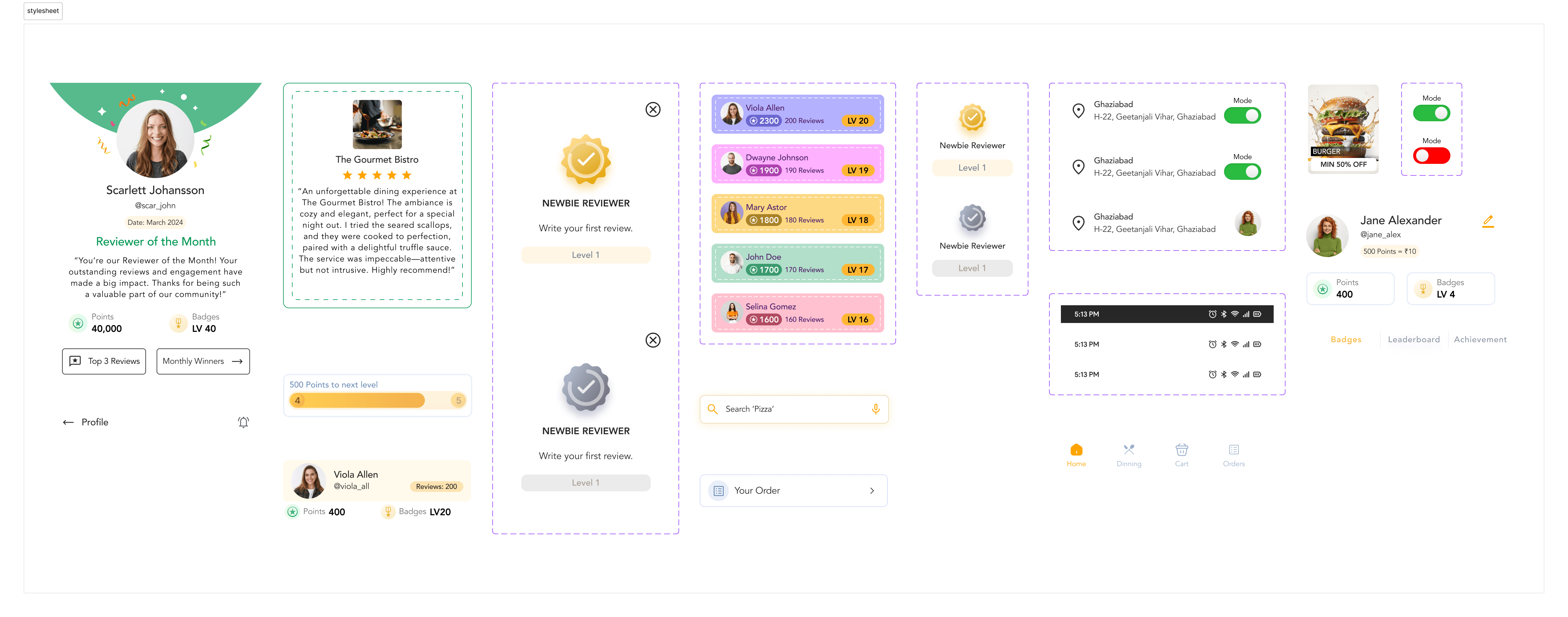
Stylesheet
A stylesheet in UX design refers to a document or file that defines the visual presentation of a user interface (UI) in a systematic and consistent manner. It includes a set of rules and guidelines that dictate how elements such as fonts, colors, spacing, and layout should appear across the application or website. Stylesheets ensure a cohesive look and feel, which enhances user experience by providing a consistent visual experience.
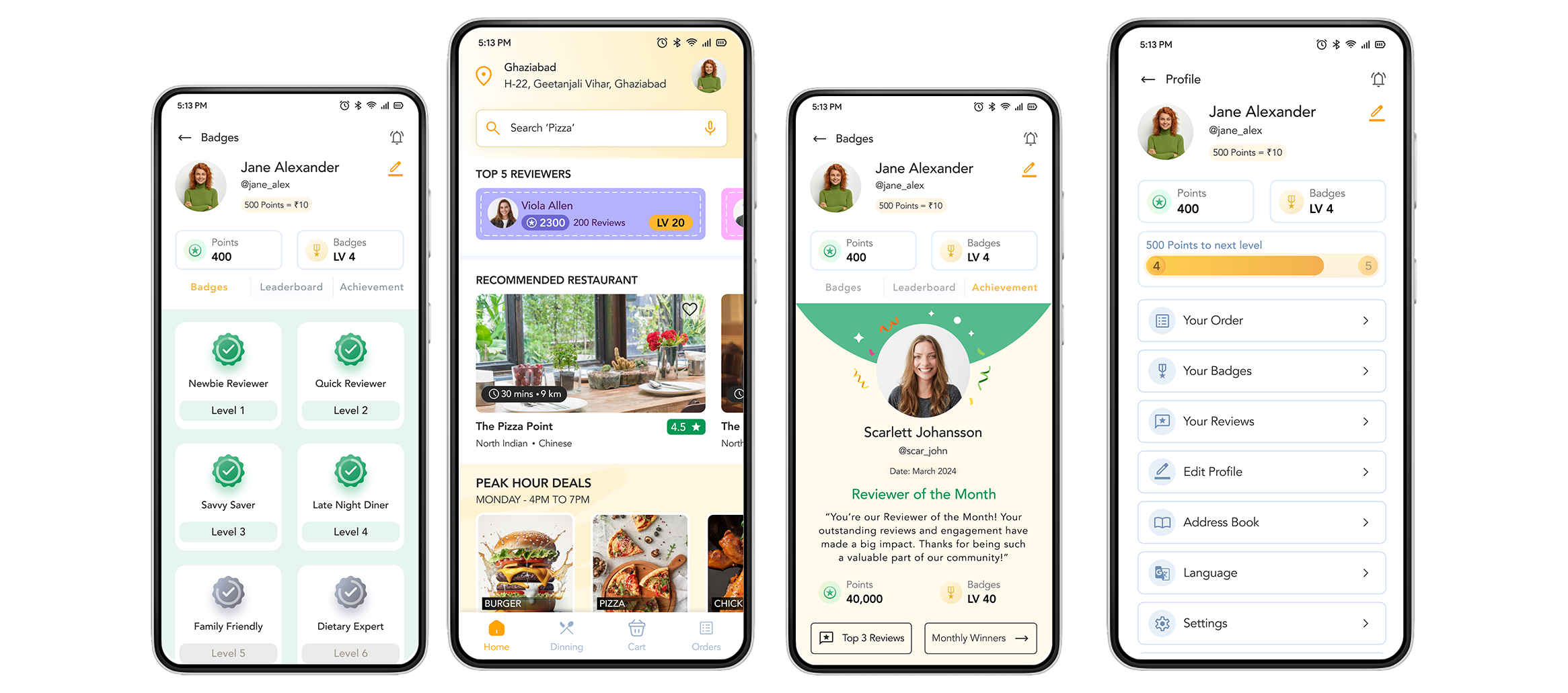
High Fidelity Designs
Branding in UX design accessibility involves ensuring that all elements of a brand's identity—visuals, tone, interactions, and emotional connections—are accessible to everyone, including people with disabilities. This approach not only adheres to ethical standards but also expands the brand's reach and inclusivity.
Final Thought and Next Step
Final Thought
With the final prototype complete, I believe I have successfully met the initial design goals. I developed a mobile app for restaurant reviews featuring tools for discovering and rating dining experiences, along with branding materials that reflect the service's values. If given more time, I would further develop nice-to-have features to enhance the app's uniqueness and competitive edge.
Next Step
Design Implementation & Handoff
With the restaurant review app design thoroughly tested and revised, it is now ready for the development phase. To ensure effective communication with developers, I have redlined and organized my design deliverables using Zeplin for handoff and am prepared to assist with any follow-up questions.
Maintenance
Future updates and revisions will be managed based on priority levels to ensure continuous improvement and alignment with user needs.
What i learned
In this project, I conducted user interviews, competitor analysis, created low-fidelity wireframes, linked prototypes, carried out a usability study, and designed high-fidelity UI screens. I gained significant insights and skills, but I recognize there is always room for improvement and further growth in this field.


