MyBiz POS Device
"Empower transactions, simplify lives."
Introduction
Project Overview
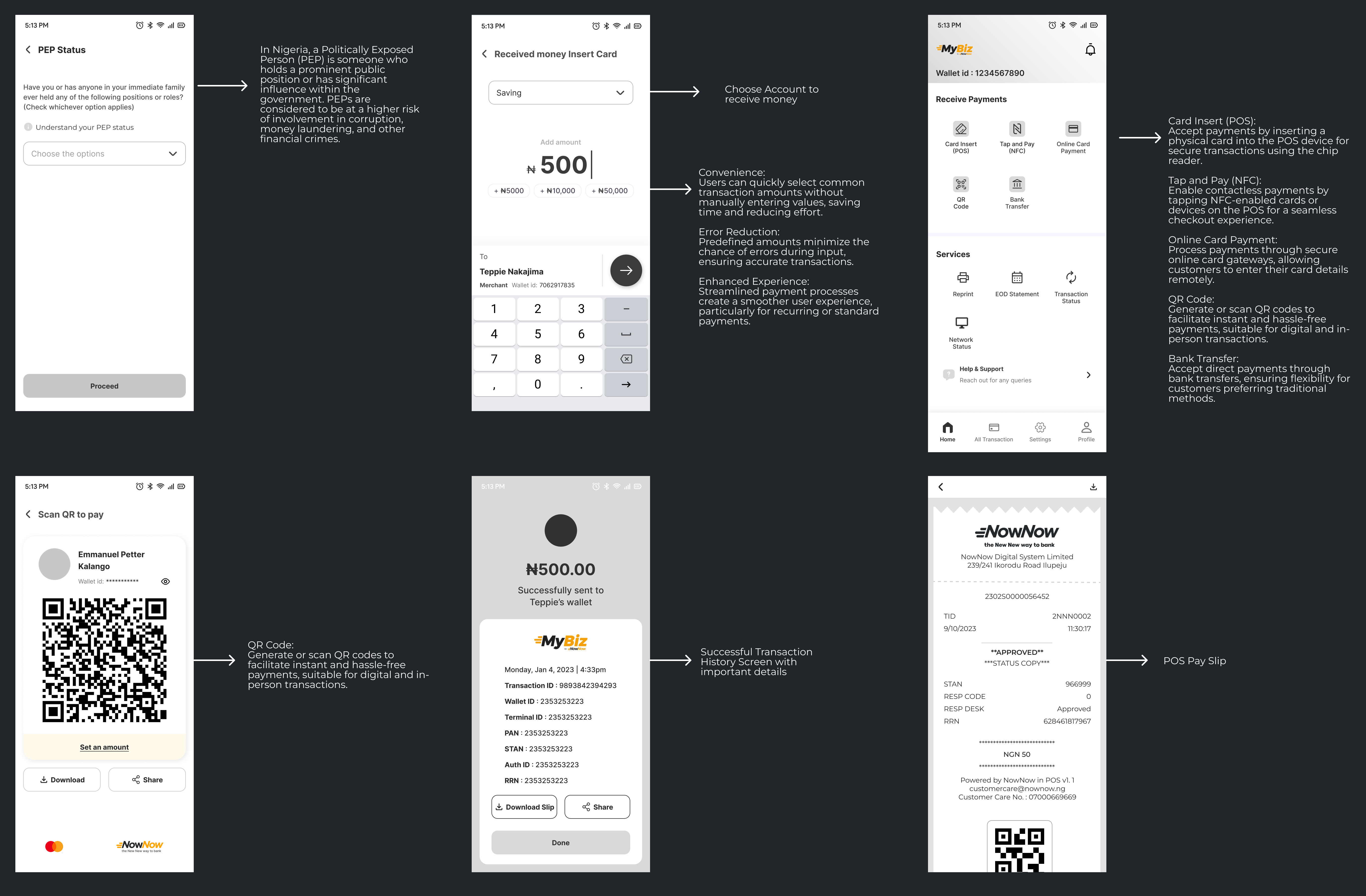
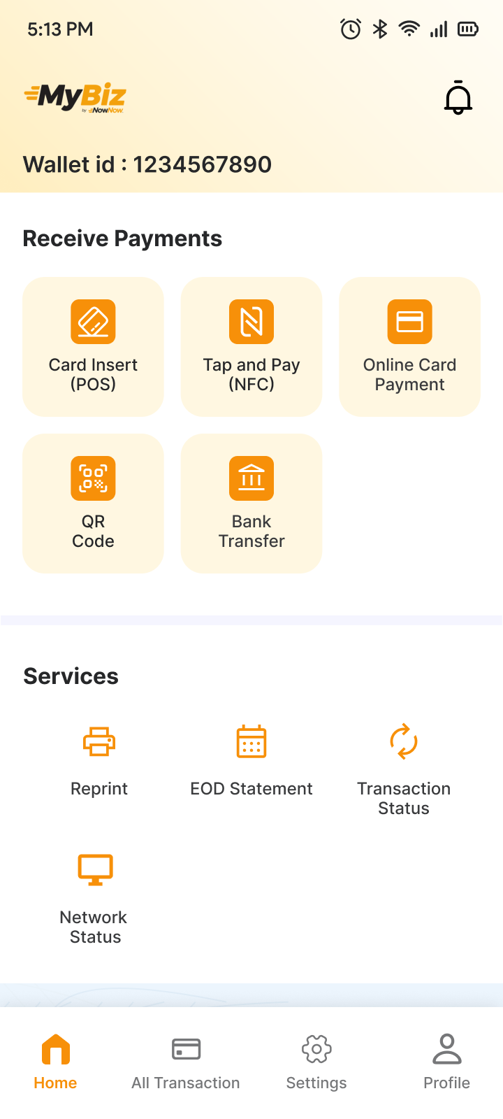
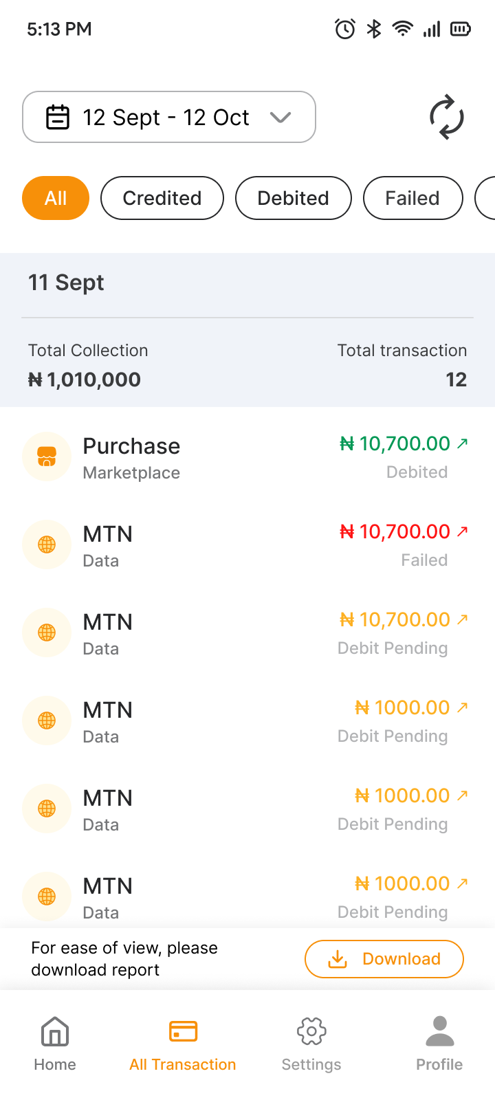
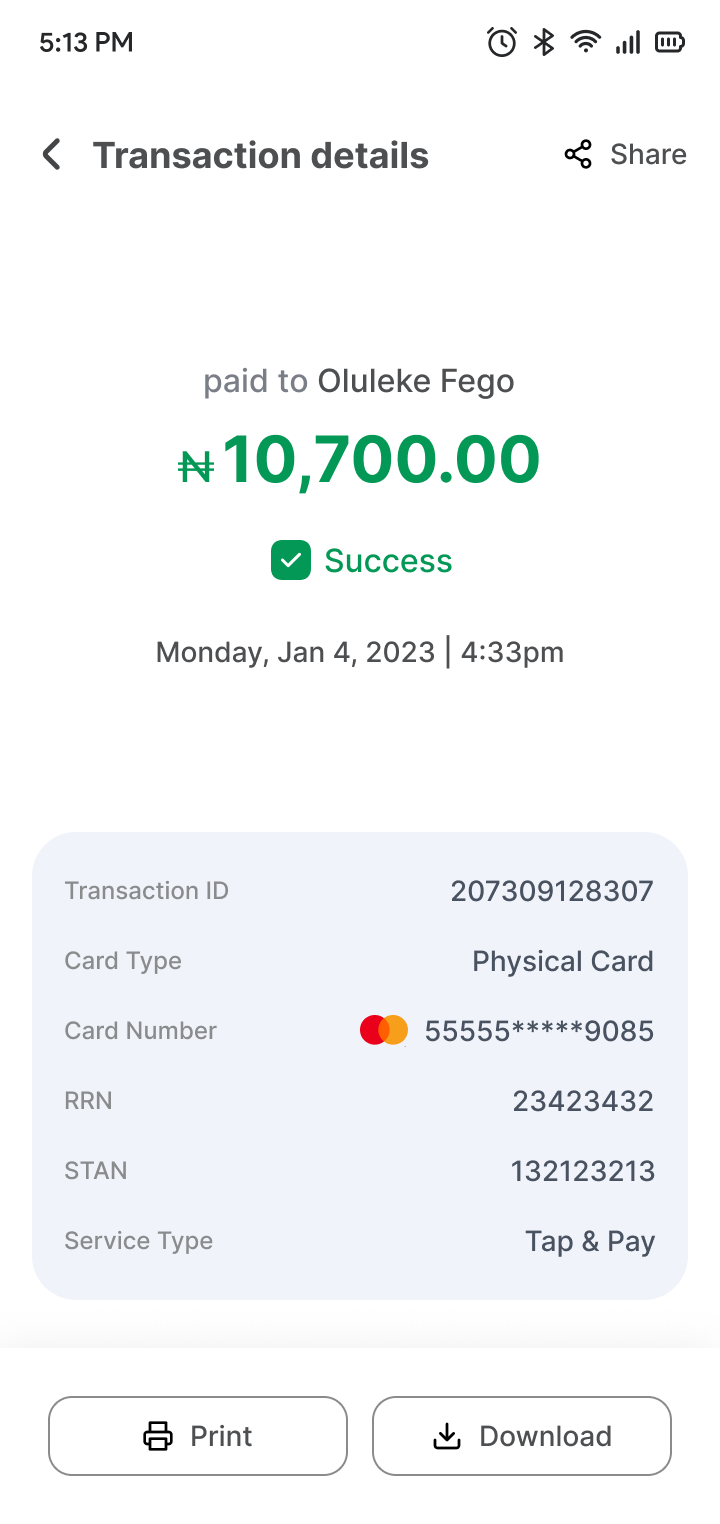
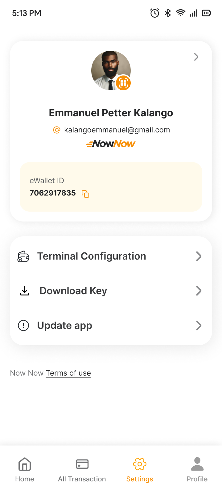
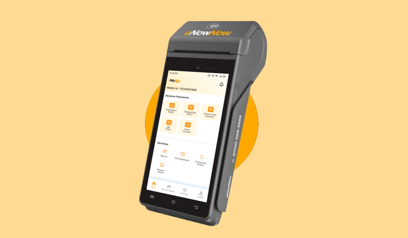
The MyBiz | BizPadi App is designed for seamless payment processing through a POS device in Nigeria. It allows users to receive payments via various methods, including card insert, tap and pay (NFC), online card payment, QR code, and bank transfer. Key features include transaction management, reprints, EOD statements, and network status, all accessible via intuitive bottom navigation.
My Role
UX Designer (User Research, Visual design, Interaction design, Usability testing)
Tools
Figma, FigJam, Miro
Duration
4 Weeks
Problem Statement
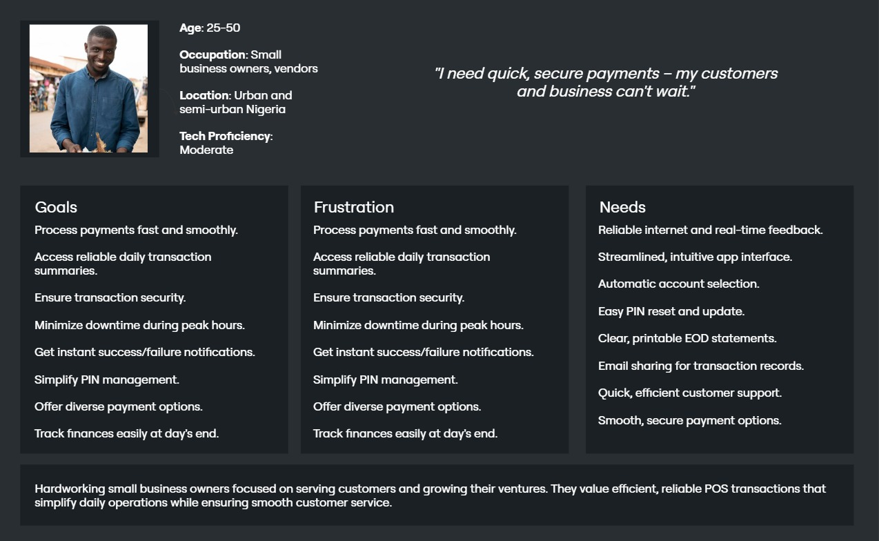
User, a small business owner in Nigeria, is a tech-savvy entrepreneur who needs a reliable and efficient POS solution to accept multiple payment methods, including card insert, tap and pay, and QR codes, because her current system is slow and lacks integration for diverse payment options, causing delays and customer dissatisfaction during transactions.
Goal Statement
The goal of the MyBiz | BizPadi App is to provide Nigerian businesses with a fast, secure, and versatile POS solution that supports multiple payment methods, including card insert, NFC, online card payments, QR codes, and bank transfers. This will streamline transaction processes, enhance customer satisfaction, and improve operational efficiency for business owners.
Business Opportunities/Needs
- Expanded Payment Options: There is a growing demand for diverse payment methods like NFC, QR codes, and bank transfers in Nigeria, providing an opportunity to cater to customers with different preferences and increase transaction success rates.
- Enhanced User Experience Offering an intuitive, user-friendly POS system with features like transaction status, reprints, and EOD statements can boost customer satisfaction and reduce friction in daily operations.
- Mobile Payment Integration: The rise of mobile payments presents an opportunity to integrate tap-and-pay (NFC) functionality, attracting tech-savvy customers and businesses looking to adopt contactless solutions.
- Streamlined Reporting: Providing easy access to transaction histories, network statuses, and EOD statements addresses the need for efficient financial tracking and reporting, saving time for business owners.
- Security and Trust: As digital payments grow, businesses need secure and reliable systems to mitigate fraud risks, creating an opportunity to establish trust through robust security features and compliance with local regulations.
Research
Research Goals
- Understand Payment Preferences: Identify the most commonly used payment methods among Nigerian consumers and businesses to prioritize integration into the POS system.
- Assess User Experience: Evaluate the ease of use and efficiency of the POS app, focusing on transaction flow, accessibility of services, and overall user satisfaction.
- Security Needs: Investigate user concerns and requirements around payment security to ensure the app meets industry standards and builds trust.
- Feature Prioritization: Determine which features (e.g., transaction status, EOD statements, reprints) are most critical to business owners for improved operational efficiency.
- Device Compatibility: Explore the types of devices businesses commonly use and ensure the app functions seamlessly across platforms and payment methods.
Research Methodology
- Secondary Research (Competitive Analysis)
- Primary Research (User Interview)
Secondary Research Competitive Analysis
| Competitor | Type | Strength | Weekness |
|---|---|---|---|
| Paga | Direct |
|
|
| Paystack | Direct |
|
|
Improvement Opportunities Based on Competitive Analysis
- Offer Advanced Payment Methods: Introduce NFC and QR code payments to stand out from competitors like Paga, Interswitch, and Paystack, which have limited support for these options.
- Simplify Setup and Integration: Provide an easy setup process and intuitive interface for businesses with minimal technical knowledge, addressing the complexity of Interswitch and Paystack's systems.
- Competitive Pricing: Implement low-cost or more competitive transaction fees, especially for small and medium businesses, to attract users dissatisfied with the high fees from Flutterwave and Paystack.
- Enhance Reporting and Analytics: Add robust reporting and transaction management features that allow businesses to track, analyze, and optimize their sales, which is currently lacking in many POS competitors.
Primary Research User Interview
Prior written consent is required to record an interview, so be sure to attach a consent form to the email. If the participant is a minor or unable to consent under applicable law, then written consent is required from the participant's parent or guardian.
UX Research consent form.
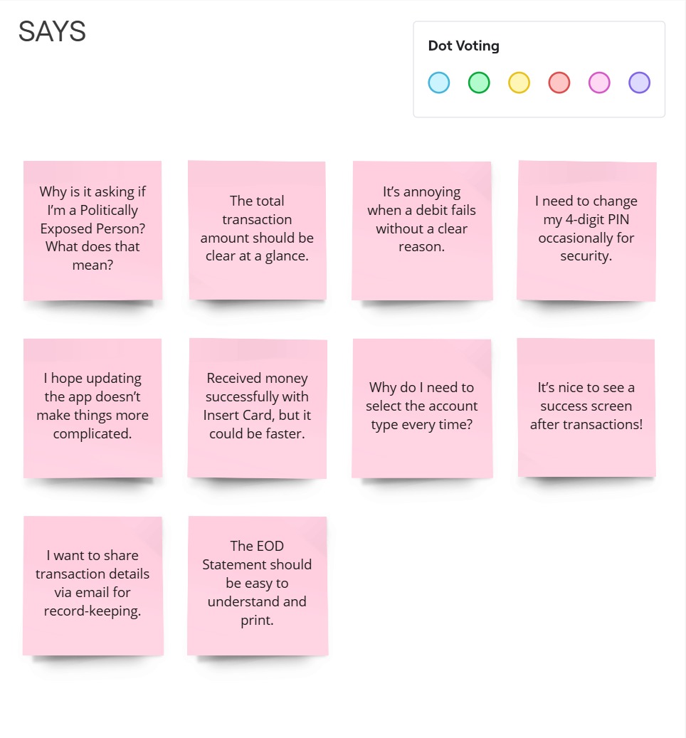
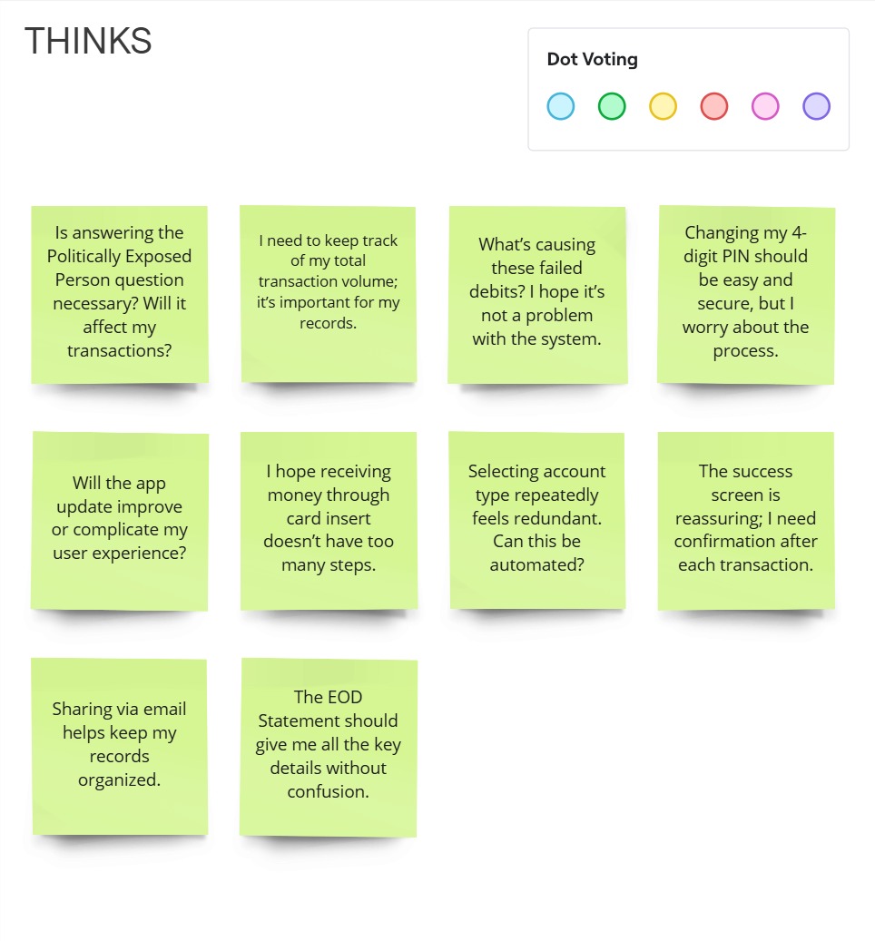
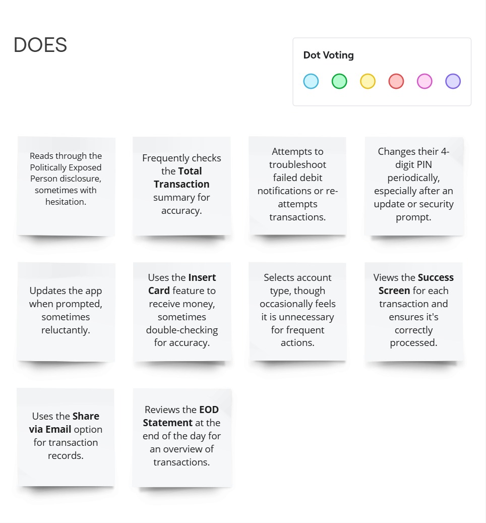
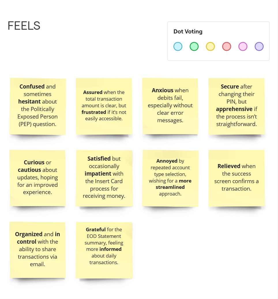
After gaining a general market understanding, I engaged directly with users to gather insights on the POS Device feature. I developed an Interview Guide with 6 open-ended questions, interviewing 10 participants (6 males, 4 females) to understand their needs and expectations for POS devices.
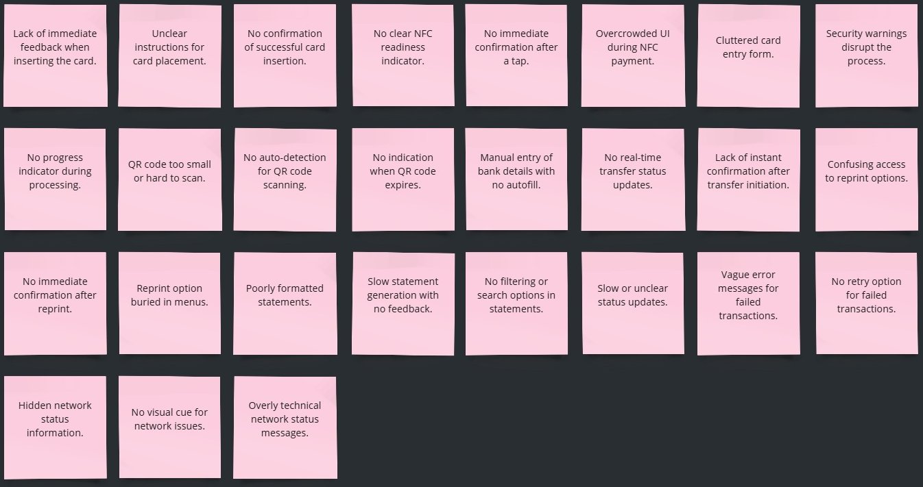
Pain Points
How Might We
Insight
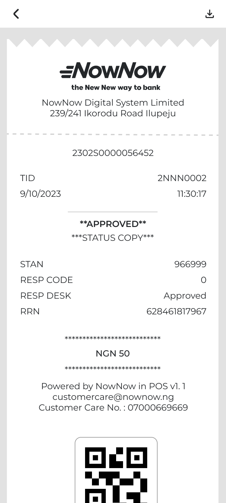
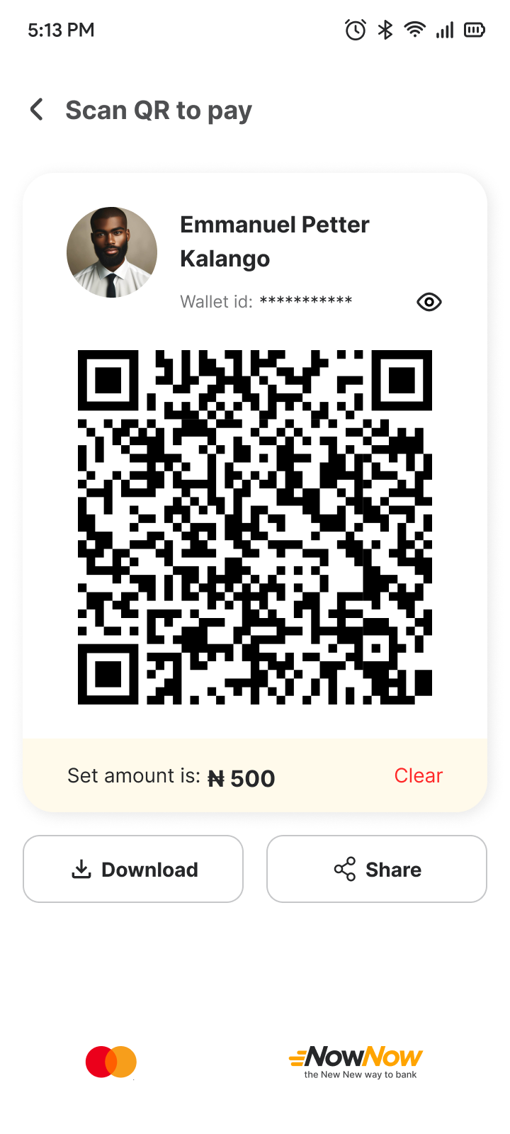
Users experience difficulty with QR code scanning due to small or poorly positioned QR codes, which leads to frustration and sometimes causes abandoned transactions.
Needs
A large, well-positioned QR code display that enhances scan success and minimizes the need for additional adjustments.
POV
Users need an easy-to-scan QR code that's consistently visible and responsive to avoid frustration and streamline the payment process.
How Might We
How might we optimize the QR code size and positioning to ensure a seamless scan experience for users?
See All HMWsIdeate Lo-fi Wireframe
Test Usability Study
Effective usability testing requires a well-defined Research Plan , including test Project background, participant, Stakeholders profiles, chosen methodologies, KPIs, and scripts. To ensure a comprehensive approach, I have created a usability testing plan that details our testing aims, scope, and preparation strategies.
In UX design, a digital wireframe is a visual guide that represents the layout and structure of a user interface. It's a low-fidelity, often grayscale design used to outline the basic elements and functionality of a digital product before adding detailed design elements or high-fidelity visuals.
Conduct Usability Testing
I conducted usability testing with five participants for the multiple login feature in the MyBiz app, recording their mistakes, observations, quotes, and task completion. The goal was to identify usability issues and gather data to improve the feature's user experience across devices. note-taking spreadsheet
Affinity Diagram
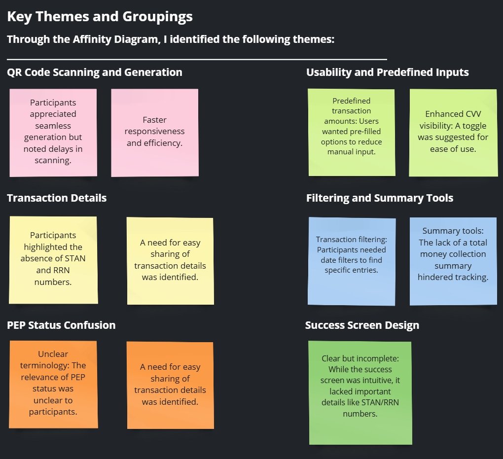
Purpose: To synthesize user research findings and uncover key patterns that informed the redesign of the app's transaction process.
Goal: Identify pain points and improvement opportunities for features such as QR code scanning, transaction details, and usability.
The Process: To organize feedback from three participants, I used an Affinity Diagram to group similar observations. This process revealed recurring themes and key areas for improvement.
Steps Taken:
- Extracted raw data from participant feedback.
- Categorized similar observations into themes.
- Identified actionable insights based on these groupings.
Pattern
Users reported that the QR code size was too small, making it difficult to scan effectively.
Insight
A small QR code can hinder usability by increasing the time and effort required for successful scanning, especially on devices with varying camera resolutions or in environments with poor lighting.
Recommendations
- Increase the QR code size to improve visibility and scan accuracy. Additionally, provide a zoom or full-screen view option to accommodate users in challenging conditions, ensuring a smoother scanning experience.
Iterate Based on the Usability Testing
Insight 1: A small QR code can hinder usability by increasing the time and effort required for successful scanning, especially on devices with varying camera resolutions or in environments with poor lighting.
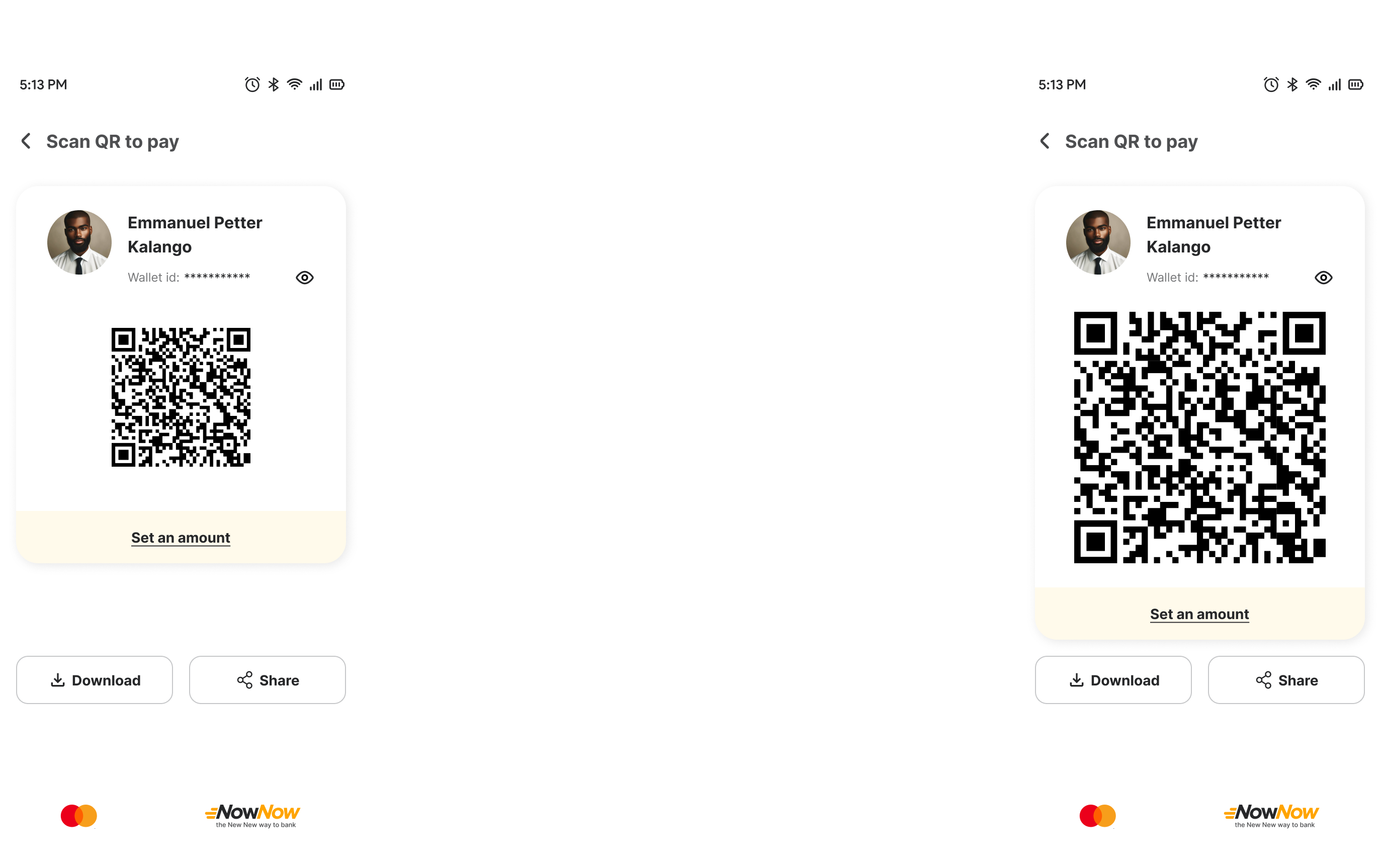
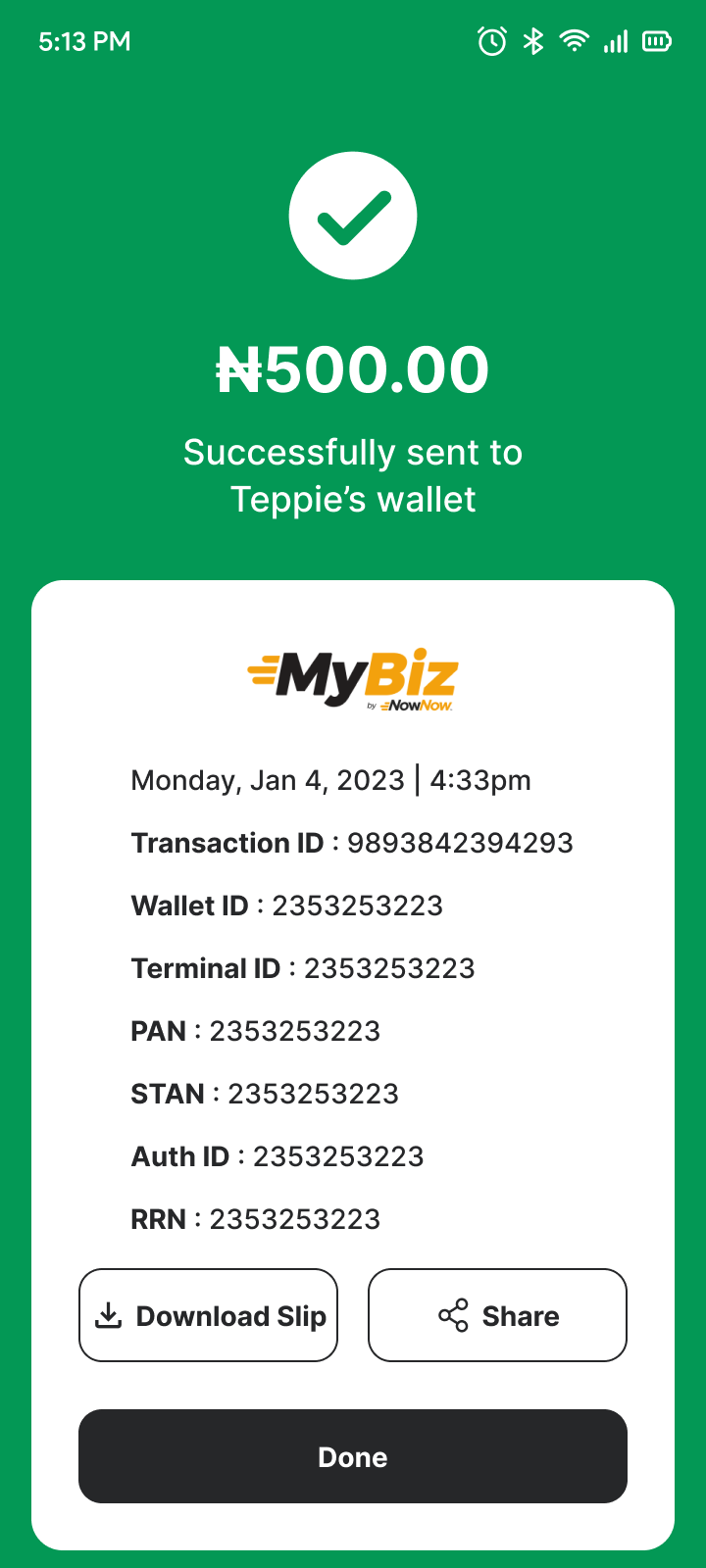
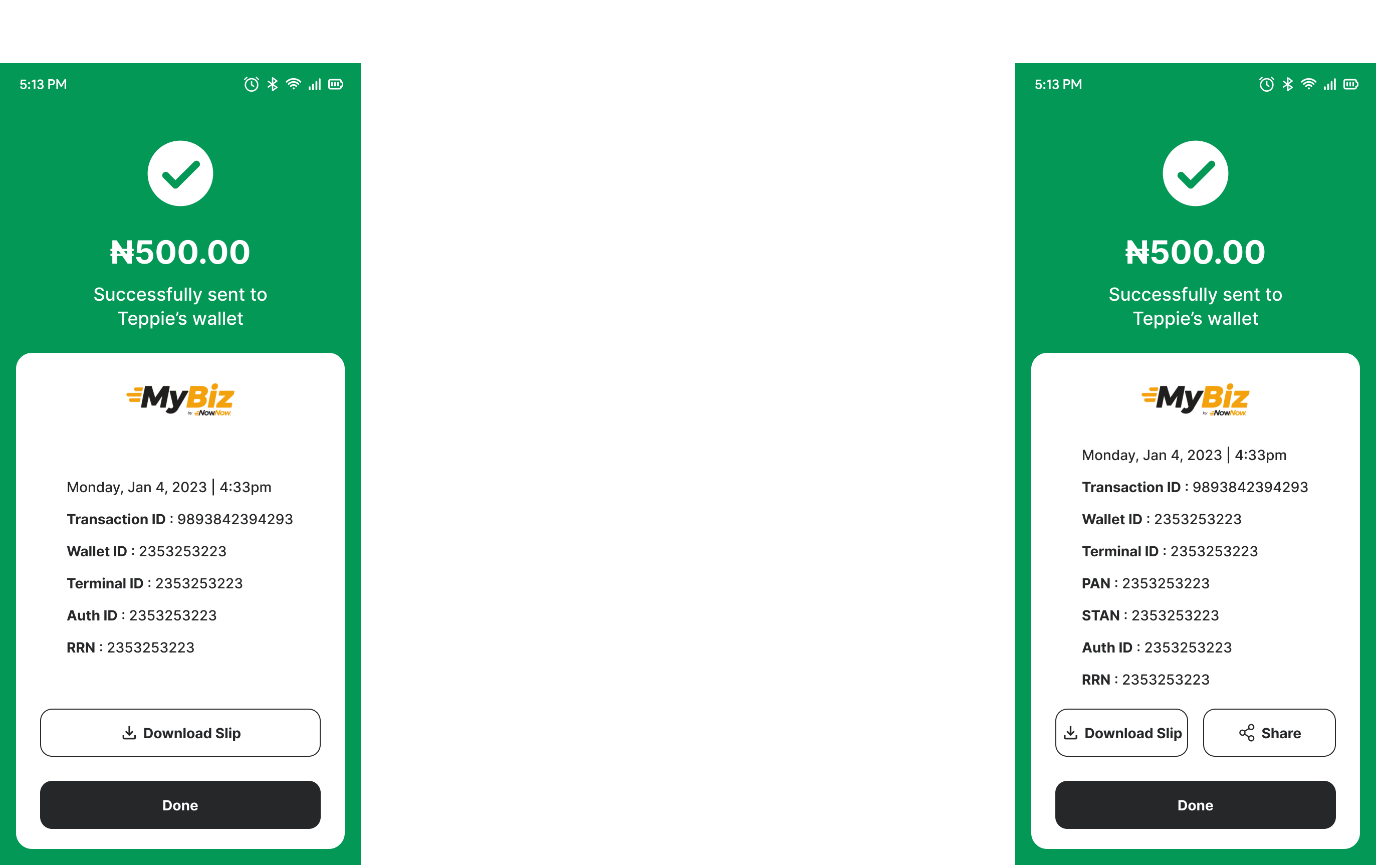
Insight 2: Missing critical information and the inability to share transaction details hinder tracking and usability.
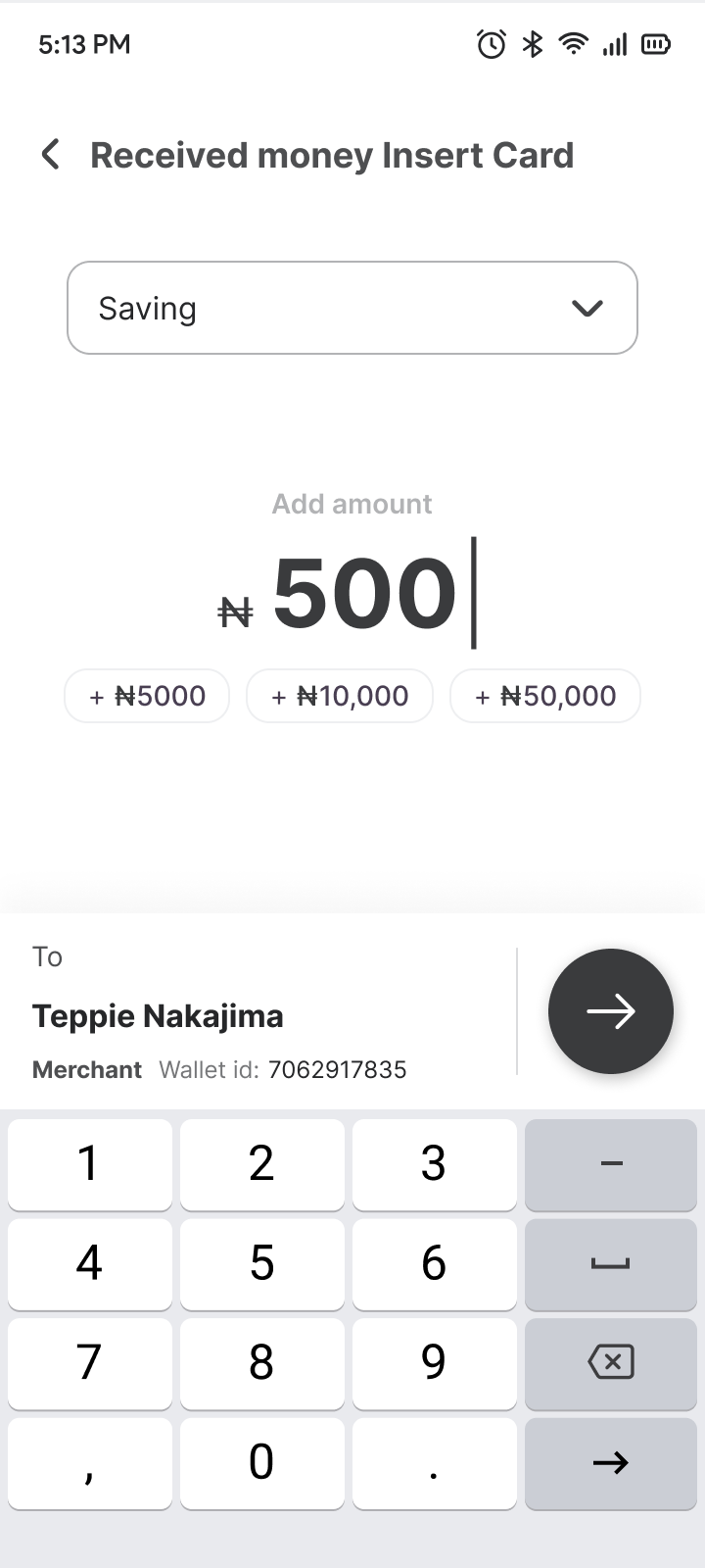
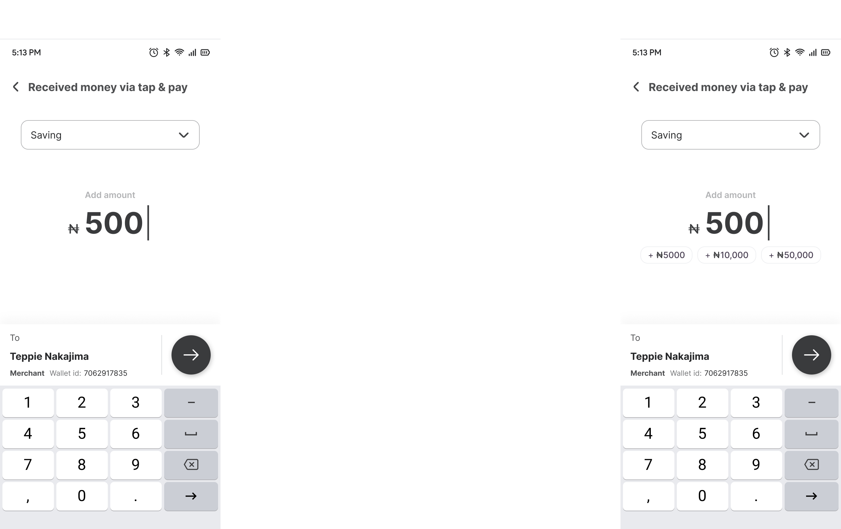
Insight 3: Manually inputting transaction amounts can be time-consuming and prone to errors, especially for frequently used amounts. Predefined amount options enhance efficiency and simplify the transaction process.
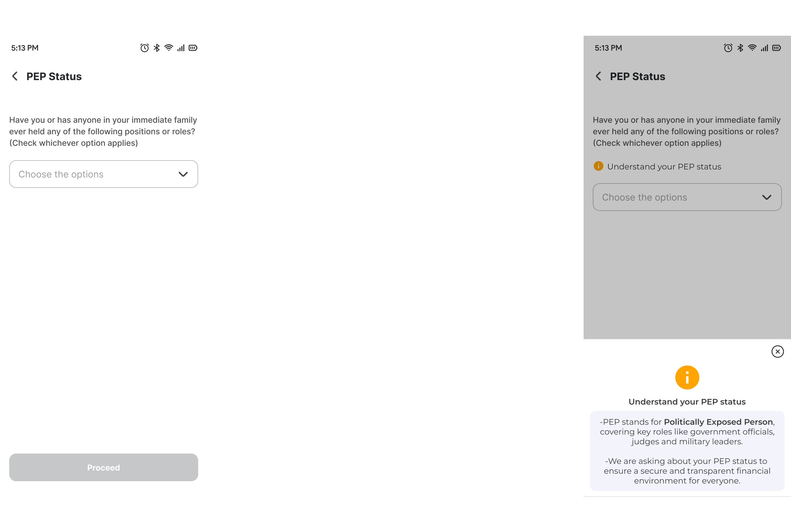
Insight 4: Ambiguity around unfamiliar terminology reduces user confidence and disrupts the workflow.
Branding
Branding in UX design accessibility involves ensuring that all elements of a brand's identity—visuals, tone, interactions, and emotional connections—are accessible to everyone, including people with disabilities. This approach not only adheres to ethical standards but also expands the brand's reach and inclusivity.
High Fidelity Designs
Impact on Business
Improved Customer Satisfaction
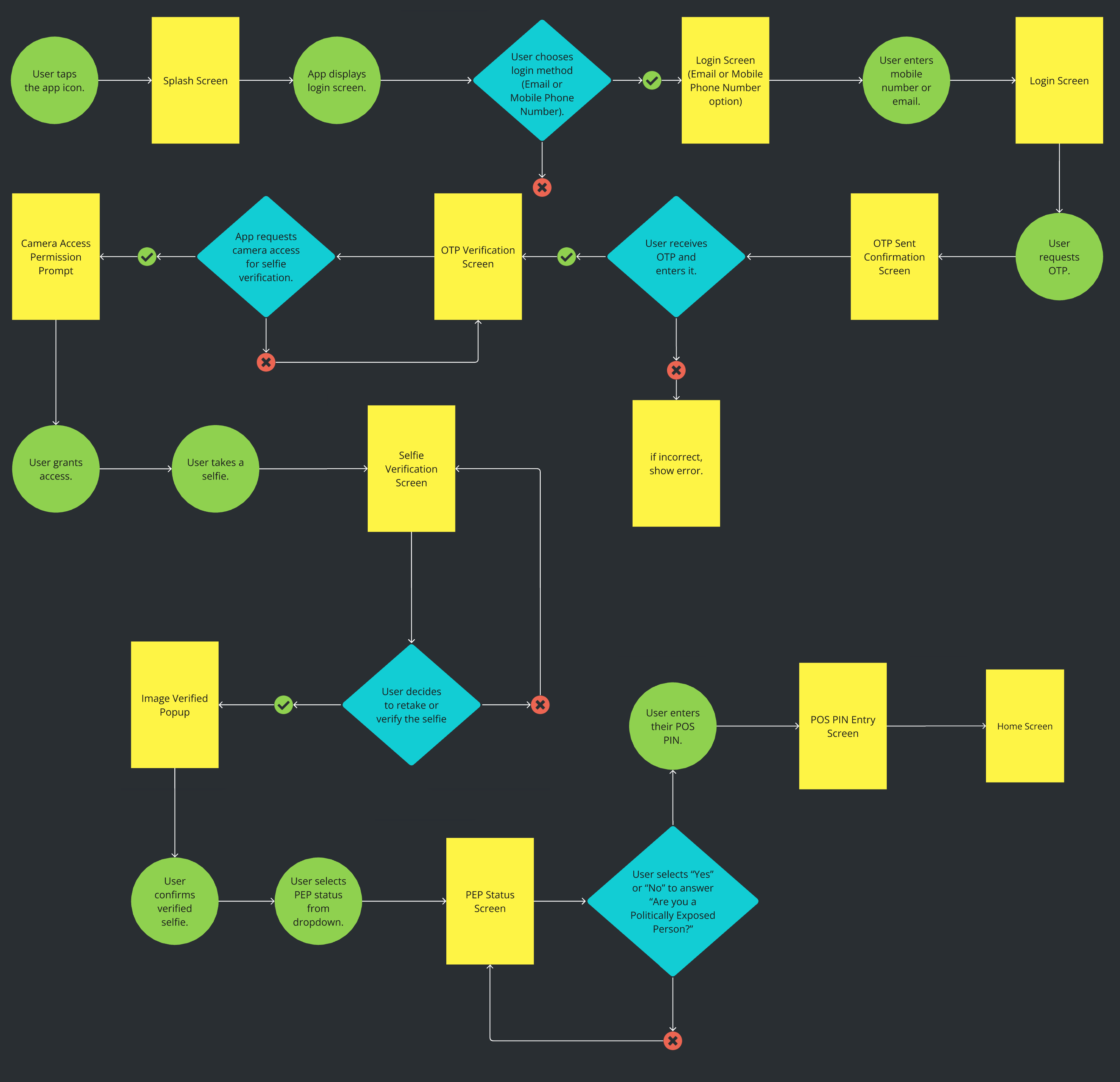
Seamless login, signup, and payment processes ensure convenience, boosting customer satisfaction and loyalty.
Increased Transaction Efficiency
Quick and reliable payment methods (e.g., card insertion, online payments, QR code) enhance productivity, enabling businesses to serve more customers in less time.
Higher Revenue Streams
Multiple payment options attract diverse customers, increasing the likelihood of payment completion and boosting overall sales.
Competitive Advantage
Offering advanced and versatile POS features positions the business as an innovative market leader, appealing to merchants and customers.
Operational Cost Savings
Streamlined processes reduce transaction errors, customer service interventions, and operational delays, saving costs over time.
Customer Trust and Retention
Secure, user-friendly systems build trust, fostering repeat transactions and long-term relationships.
Enhanced Brand Image
Demonstrating innovation and customer-centric solutions enhances reputation, drawing more business partnerships.
Final Thought and Next Step
Final Thought
Predefined amount chips are a simple yet powerful addition that directly addresses user pain points related to transaction efficiency. By implementing this feature, we streamline the user journey, enhance satisfaction, and create a more seamless payment experience, ultimately fostering loyalty and increasing engagement with the app.
Next Step
The immediate next step is to create a prototype that incorporates predefined amount chips and conduct usability testing to gather feedback. Based on user insights, refine the design to ensure it meets expectations and aligns with business goals. After testing and iteration, roll out the feature in a phased manner, starting with a limited beta release to monitor performance and adoption.
Maintenance
Ongoing maintenance will include tracking usage metrics to identify popular predefined amounts and ensuring the chips remain relevant and customizable. Regular feedback collection from users will help address any emerging issues, while periodic updates will introduce enhancements like AI-driven suggestions to keep the feature dynamic and useful.
What i learned
This project highlighted the importance of focusing on small, user-centric design improvements that can have a significant impact. I learned how understanding user behaviors and pain points leads to actionable insights, and how iterative design processes ensure that features are both practical and impactful.
