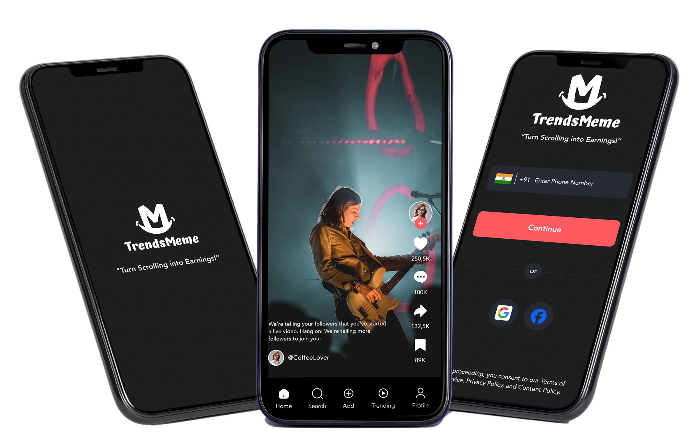
TrendsMeme app
Empowering your creativity—share and enjoy memes like never before
My Role
Project Scope
The project aims to develop a comprehensive platform for users to create, share, and engage with memes in the form of messages, images, and videos.
Tools
Figma, Photoshop, Invision
Role
UX Designer (User Research, Visual design, Interection design, Usability testing)
Duration
1 Month
Design Process
Design Thinking
Empathize
- Business Requirement
- 5Ws
- Problem Statement
- Conduct Research
Define
Analyze Research
- Pain Points
Ideate
ideate ux Solution
- How Might We
- Task Flows
- User Flow
- Paper Wireframe
- Digital Wireframe
Prototype
- Wireframe
- Ui Design
Test
- Test Ux with users
EmpathizeBusiness Requirement
Project Summary and Background
This document outlines the business requirements for a meme-sharing app that allows users to create, share, and engage with memes. The app targets a diverse audience, from casual users to dedicated content creators, capitalizing on the growing popularity of memes as a form of online expression and cultural commentary.
Memes have become a significant part of online culture, with millions of users creating and sharing memes daily. However, existing platforms often lack the tools and community features specifically designed for meme enthusiasts. The proposed app will fill this gap by offering a dedicated space for meme creation, sharing, and community interaction.
BRD LinkProject Scope
The project will include the development of a mobile app available on iOS and Android platforms, along with a web version. The app will feature tools for creating memes, sharing them with others, and engaging with the meme community through likes, comments, and shares. Additionally, the app will support user profiles, a leaderboard system, and trending meme sections. The project scope covers:
- User authentication and profile management
- Meme creation tools (e.g., templates, text overlays, image editing)
- Social features (likes, comments, shares, and following users)
- Content discovery (trending memes, personalized feeds)
- Notification system for user engagement
- Moderation tools to handle inappropriate content
- Integration with other social media platforms
Empathize5Ws Guideline
Who
Target Users:
The app is designed for millennials and Gen Z users who are familiar with and actively engaged in meme culture. This includes casual users who enjoy browsing and sharing memes, as well as dedicated creators who want to produce and distribute original content.
- Project Manager: Oversees project timelines, budgets, and resource allocation.
- Product Owner: Ensures that the app meets user needs and aligns with business goals.
- Development Team: Responsible for coding and technical implementation.
- Design Team: Focuses on creating an intuitive and engaging UI/UX.
- Marketing Team: Drives user acquisition and promotes the app.
- Moderators: Maintain community standards by overseeing content moderation.
What
Project Goal:
The goal is to create a meme-sharing app that offers tools for meme creation, community interaction, and content discovery, serving as a centralized platform for meme enthusiasts.
- Meme creation tools including templates, text overlays, and basic image editing.
- Social features like likes, comments, shares, and following other users.
- Content discovery features like trending memes and personalized feeds.
- User authentication, profile management, and a notification system.
- Content moderation to manage and filter inappropriate content.
Monetization Model:
The app will operate on a freemium model, with a free tier offering basic features and a premium tier providing advanced tools and an ad-free experience.
When
Project Timeline:
The development of the app will follow an agile methodology, allowing for iterative improvements and timely updates based on user feedback. The initial release will focus on delivering high-priority features, with subsequent updates adding medium and low-priority features.
- Initial Development: Focus on core features (e.g., meme creation, social interaction) and ensuring a stable platform.
- Beta Testing: Conducted to gather user feedback and refine the app before the full launch.
- Full Launch: Targeted within a specific timeline (e.g., within six months) to coincide with a marketing push.
Where
Platforms:
The app will be available across multiple platforms, including iOS, Android ensuring broad accessibility for users.
While the app is designed with a global audience in mind, initial marketing efforts will focus on regions with high engagement in meme culture, particularly in countries like India, where meme-sharing is extremely popular.
Why
Purpose:
Memes have become a significant form of cultural expression and entertainment. However, existing platforms are not optimized for meme-specific content, leading to a fragmented user experience. This app aims to fill that gap by offering a dedicated space for meme enthusiasts to create, share, and engage with content.
- User Acquisition: Build a large user base by providing a unique, meme-focused experience.
- User Engagement: Encourage active participation through social features and content discovery.
- Revenue Generation: Monetize the app through ads, in-app purchases, and subscriptions, ensuring sustainability and growth.
- Community Building: Foster a vibrant community where users feel safe to express themselves and connect with others who share their interests.
EmpathizeProblem Statement
Problem statement clearly defines a specific issue or challenge faced by users. It articulates what the problem is, who it affects, and the impact on their experience. This statement guides the design process by focusing on solving user needs and improving the overall experience.
User is a meme enthusiast who needs an app with advanced customization tools and a streamlined, user-friendly interface because the current app's slow performance, limited features, and complex processes prevent him from efficiently creating, sharing, and discovering high-quality memes.
EmpathizeResearch
Research deepens my understanding of users' frustrations, hopes, fears, abilities, limitations, reasoning, and goals, forming the foundation for effective solutions. To ensure focused and structured research, I create a detailed research plan before the research phase, Problem statement, outlining goals, participants, and timelines to guide app design.
UX Research consent form
Prior written consent is required to record an interview, so be sure to attach a consent form to the email. If the participant is a minor or unable to consent under applicable law, then written consent is required from the participant's parent or guardian.
UX Research consent form
Research Goals
- Learn what types of memes users like and how they want to create and share them.
- Understand how users find memes and what makes them engage with content.
- Explore what makes users interact and connect with others in meme communities.
- Identify common issues with content moderation and figure out how to handle them effectively.
- Investigate ways to earn money from the app through ads and in-app purchases.
- Look at other meme platforms to find out what they do well and where the new app can stand out.
- Collect and use user feedback to make the app better and more user-friendly.
- Ensure the app can handle uploading and playing media smoothly.
Assumptions
- Users are motivated to share and create memes that reflect their unique sense of humor and creativity.
- Users engage with memes that include multimedia elements such as images and videos to make their content more engaging.
- Users prefer an app with an intuitive and easy-to-navigate interface to simplify the creation and sharing process.
- Users are motivated by the ability to interact with others through comments, likes, and shares within the app.
- Users appreciate personalized content recommendations based on their activity and preferences.
- Users value effective tools for reporting and moderating inappropriate content to maintain a positive environment.
- Users expect quick and helpful customer support to address any issues or questions they may have.
Research Methodology
- Secondary Research (Market Research, Competitive Analysis)
- Primary Research (User Interview)
Secondary Research
Market Research
Industry Overview
The memes industry has seen exponential growth in recent years, driven by the rise of social media and the increasing prevalence of digital communication. Memes have become a dominant form of content across various platforms, providing a blend of humor, commentary, and cultural commentary. The industry encompasses meme creation, sharing, and consumption, supported by a range of platforms and tools.
Major Platforms
Social Media Platforms: Facebook, Instagram, Twitter, and TikTok are primary channels for meme distribution. Each platform has unique characteristics:
- Facebook: Popular for sharing viral memes within groups and pages.
- Instagram: Known for meme accounts and stories featuring trending content.
- Twitter: Used for real-time meme sharing and viral trends.
- Meme-Specific Apps: Platforms like Meme Generator, Memedroid, and iFunny cater specifically to meme creation and sharing. These apps often include tools for creating and customizing memes.
Demographic Insights
Age Groups
- 18-24: This group is highly engaged with meme culture, using memes to communicate humor and trends. They are active across all major social media platforms.
- 25-34: Also engaged with memes but often share content more selectively. They use memes to connect with cultural and social trends.
- 35-44: Less active but still engaged, often using memes for entertainment and as conversation starters.
- 45+: Growing segment with increasing engagement, typically consuming memes through platforms like Facebook.
Memes Habits
- Creation: Users create memes using tools on social media platforms or dedicated meme apps. Customization and personalization are key features, with many users adapting popular templates to fit their context.
- Sharing: Memes are often shared for entertainment, commentary, or to engage with current events. Users frequently share memes in group chats, on personal profiles, or within specialized communities.
- Trends: Memes often reflect current trends, viral challenges, and cultural moments. Staying updated with trends is crucial for both creators and consumers.
Consumption Patterns
- Frequency: Users consume memes daily, with peak engagement during leisure times such as evenings and weekends.
- Content Types: Popular content includes humorous memes, political satire, pop culture references, and relatable life experiences. The format ranges from image-based memes to video clips and GIFs.
- Engagement: Memes often drive high engagement through likes, shares, and comments. The interactive nature of memes encourages user participation and community building.
Market Trends
- Monetization: Brands and influencers are increasingly leveraging memes for marketing, often collaborating with popular meme creators or using memes in advertising campaigns.
- Innovation: Advances in AI and machine learning are being used to create and personalize memes, enhancing user experience and engagement.
- Cross-Platform Integration: Memes are being integrated into various digital communication tools, including messaging apps and virtual reality platforms, expanding their reach and impact.
Competitive Audit
Primary Research
User Interviews
Building on a general market and audience understanding, I deepened my engagement to connect with users directly, gathering insights through primary research.
I've crafted an Interview Guide with 10 open-ended questions to enhance user interviews, inviting participants to share their experiences and preferences.
We interviewed 10 participants (6 males and 4 females) about their experiences and expectations regarding meme-sharing platforms, focusing on features, engagement, and content discovery.
Assumptions Validated
- Users are motivated to share and create memes that reflect their unique sense of humor and creativity. Validated 5/10 Users are motivated to share and create memes that showcase their creativity and humor.
- Users engage with memes that include multimedia elements such as images and videos to make their content more engaging. Validated 4/10 Users engage with multimedia elements (images, videos) to make their memes more engaging.
- Users prefer an app with an intuitive and easy-to-navigate interface to simplify the creation and sharing process. Validated 8/10 Users prefer an intuitive and easy-to-navigate interface for meme creation and sharing.
- Users are motivated by the ability to interact with others through comments, likes, and shares within the app. Validated 6/10 Users value the ability to interact with others through comments, likes, and shares.
- Users appreciate personalized content recommendations based on their activity and preferences. Not Validated 3/10 The impact and effectiveness of personalized content recommendations based on user activity and preferences need further validation.
- Users value effective tools for reporting and moderating inappropriate content to maintain a positive environment. Not Validated 2/10 The effectiveness of moderation and reporting tools in maintaining a positive environment and addressing inappropriate content has not yet been fully validated.
- Users expect quick and helpful customer support to address any issues or questions they may have. Validated 4/10 Users expect quick and helpful customer support for addressing issues and questions.
EmpathizeEmpathy Map
Based on primary research, I've gathered extensive user data, which I am now synthesizing using an Empathy Map. This process will help us understand user needs and behaviors more deeply, informing the development of our restaurant review app.
Research Synthesis
EmpathizePersona
Based on our research and insights from the Empathy Map, it’s time to develop user personas for our meme-sharing app. These personas will be the hilarious and relatable characters that guide the design and features of our app. In UX design, a persona is a fictional, yet representative user created from research to embody key traits, behaviors, and goals of our target users. These personas help us understand what makes users laugh, what memes they love, and how they share their humor, guiding design decisions to create a more engaging and fun app experience.
EmpathizeJourney Map
A journey map for a meme-sharing app tracks the user experience from discovering and downloading the app, setting up a profile, exploring trending memes, creating and uploading content, to engaging with the community. It highlights user emotions and identifies friction points to improve the overall experience.
DefinePain Points
In UX design, pain points are specific issues or challenges users face while interacting with a product. They can stem from usability, performance, content, design, interaction, emotional response, financial concerns, or support.
IdeateHow Might We
HMW stands for "How Might We" in UX design. It's a question format used to frame problems and opportunities in a way that encourages creative thinking and brainstorming for solutions. The goal is to explore possible solutions by rephrasing challenges into open-ended questions.
Insight
Users enjoy browsing memes in their preferred language, which enhances their engagement and connection with the content.
Needs
Users need an easy way to select and switch between languages to ensure they see memes in the language they are most comfortable with.
POV
User, a bilingual meme enthusiast, needs a quick and intuitive way to view memes in his preferred language because it helps him connect more deeply with the humor and cultural references.
HMW
How might we enable users to easily select and switch between languages to personalize their meme-viewing experience?
Insight
Users want control over the content in their home feed to ensure it aligns with their interests and preferences, making their experience more enjoyable and relevant.
Needs
Users need a simple and flexible way to customize their home feed by selecting topics, categories, or types of memes they want to see.
POV
Priya, a meme enthusiast who enjoys diverse content, needs an easy way to personalize her home feed because it allows her to discover and engage with memes that match her unique interests.
HMW
How might we allow users to easily customize their home feed to display the meme content that best suits their preferences?
Insight
Users appreciate being personally addressed and want to feel recognized within the app, which enhances their sense of belonging and engagement.
Needs
Users need a simple and friendly way to input their preferred name or nickname so they feel more connected to the app experience.
POV
Neha, a creative user who values personal connection, needs a way to set her preferred name within the app because it helps her feel acknowledged and more engaged with the community.
HMW
How might we create a welcoming and personal experience by allowing users to easily set their preferred name or nickname in the app?
Insight
Users are more engaged when their home feed features content aligned with their specific interests, such as health & fitness, allowing them to explore and enjoy topics they care about.
Needs
Users need an easy and intuitive way to select specific interests, like health & fitness, to ensure their home feed reflects their passions and preferences.
POV
User, a fitness enthusiast who values staying informed about health trends, needs a way to customize his home feed to include health & fitness content because it helps him stay motivated and aligned with his lifestyle goals.
HMW
How might we enable users to personalize their home feed by easily selecting specific interests, such as health & fitness, to enhance their engagement and satisfaction?
Insight
Users find it more convenient and engaging to interact with apps using voice commands, especially when selecting interests like Health, Sports, or Funny Memes.
Needs
Users need a voice-enabled option to easily choose their interests, making the process faster and more accessible, especially when they are multitasking or prefer hands-free interaction.
POV
User, a multitasking user who values convenience, needs a voice command feature to select her interests like Health, Sports, and Funny Memes because it allows her to quickly personalize her experience without interrupting her workflow.
HMW
How might we enable users to select their interests through voice commands, making the app more accessible and convenient for users who prefer or need hands-free interaction?
Insight
Users prefer flexible and convenient login options that allow them to quickly access the app using their preferred method, whether through a mobile number or a Google account.
Needs
Users need a choice between logging in with their mobile number or Google account to ensure a seamless and personalized experience that matches their preferences.
POV
User, a busy professional who values efficiency, needs a quick and hassle-free login option using either his mobile number or Google account because it saves time and makes accessing the app more convenient.
HMW
How might we provide users with flexible and easy-to-use login options, allowing them to choose between using their mobile number or Google account for a more convenient experience?
Insight
Users face challenges with the meme creation, uploading, and approval processes.
Needs
Users need a streamlined creation and uploading process with quick content approval.
POV
Users want a smooth and efficient process for creating, sharing, and publishing memes.
HMW
How might we simplify the creation and uploading processes and speed up content approval?
Insight
Users experience slow responses, limited support options, and unhelpful interactions.
Needs
Users need fast, accessible support with effective solutions and personalized assistance.
POV
Users want timely and helpful support to resolve issues and enhance their experience.
HMW
How might we improve support access and effectiveness to better assist users?
Insight
Users are frustrated by the high costs associated with premium features and intrusive ads, which impact their overall experience.
Needs
Users need affordable pricing options, value for money, and a seamless ad experience.
POV
Users want to enjoy the app's features and content without feeling burdened by high costs or disruptive ads.
HMW
How might we offer more affordable pricing and enhance the user experience by minimizing interruptions from ads?
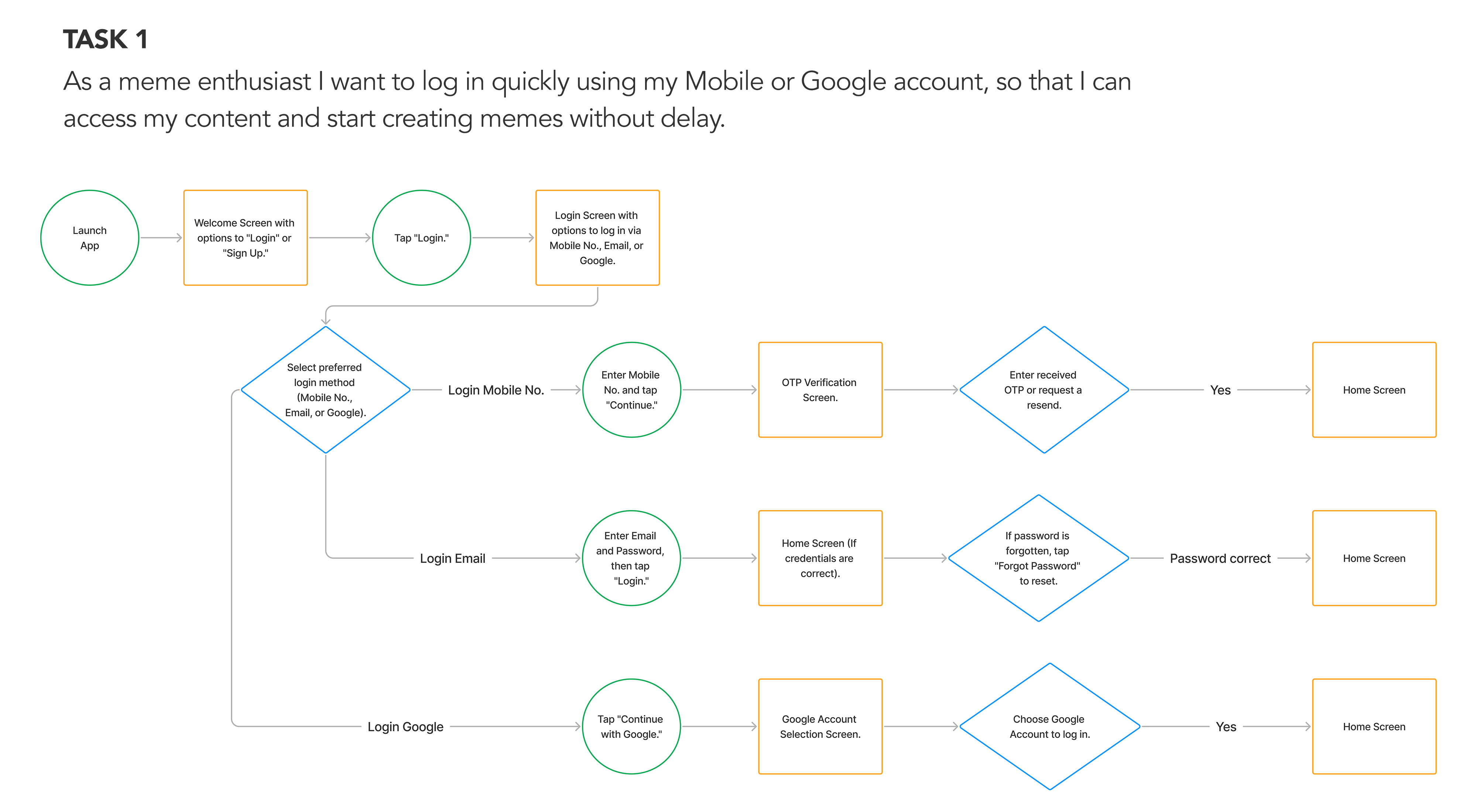
IdeateTask Flow
By creating three task flows centered on Restaurant Review App's key features, I aimed to improve user navigation and task completion. This method helped me design effectively and evaluate the user experience.

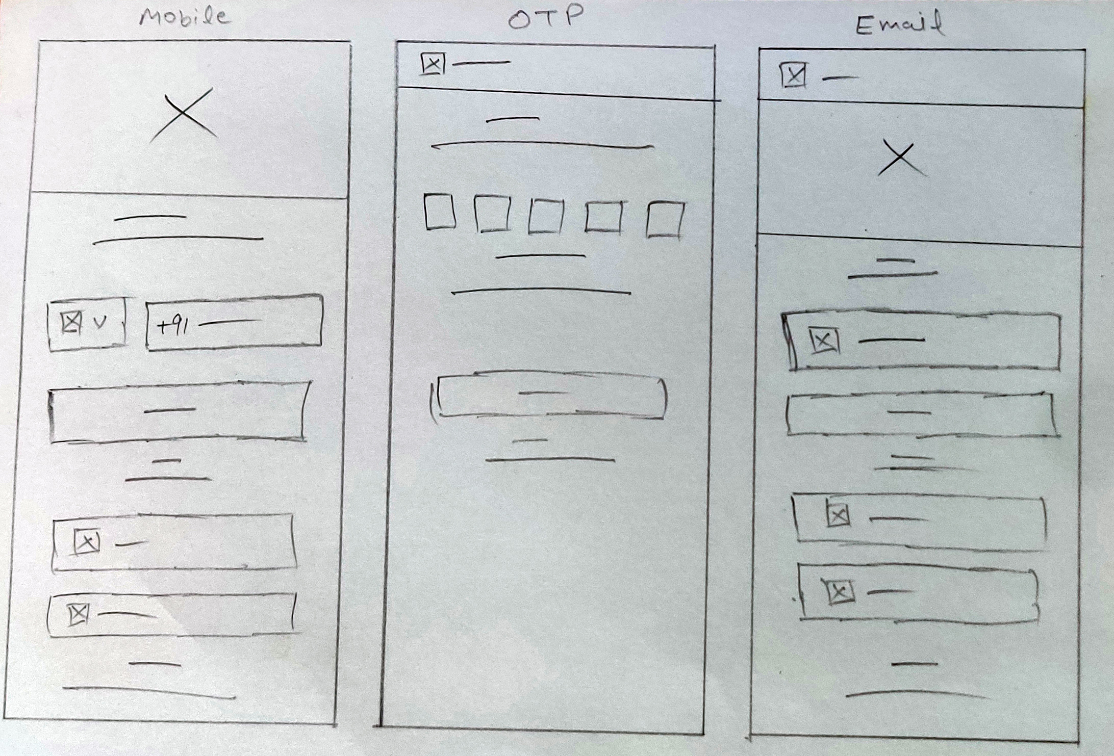
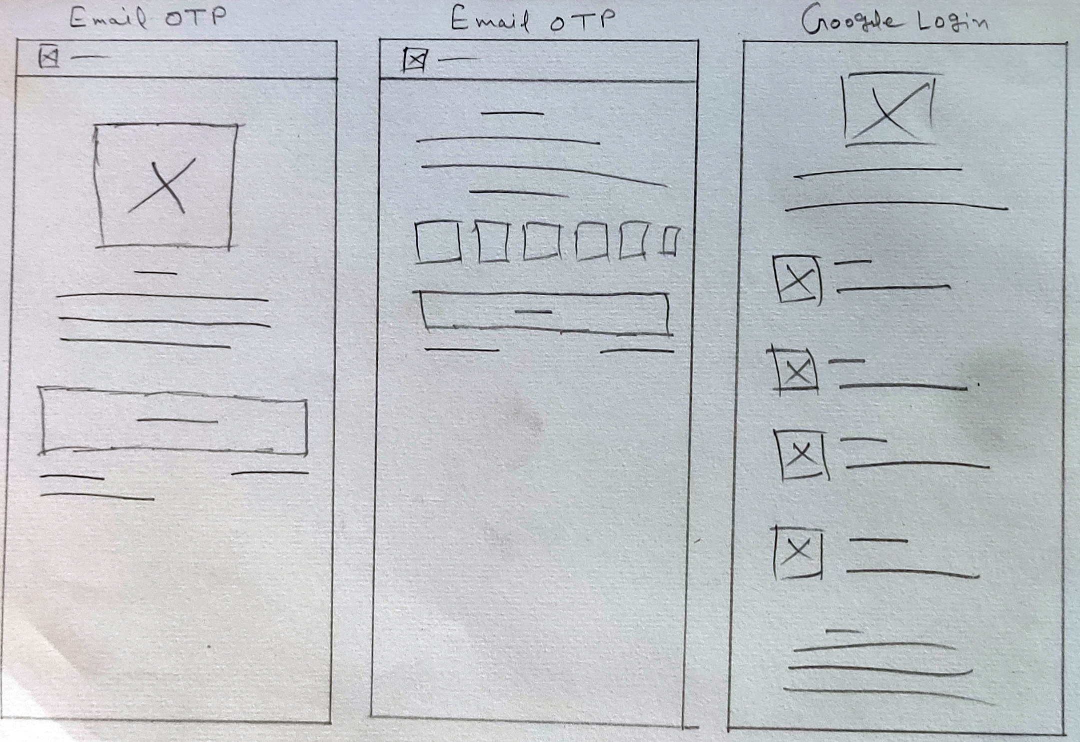
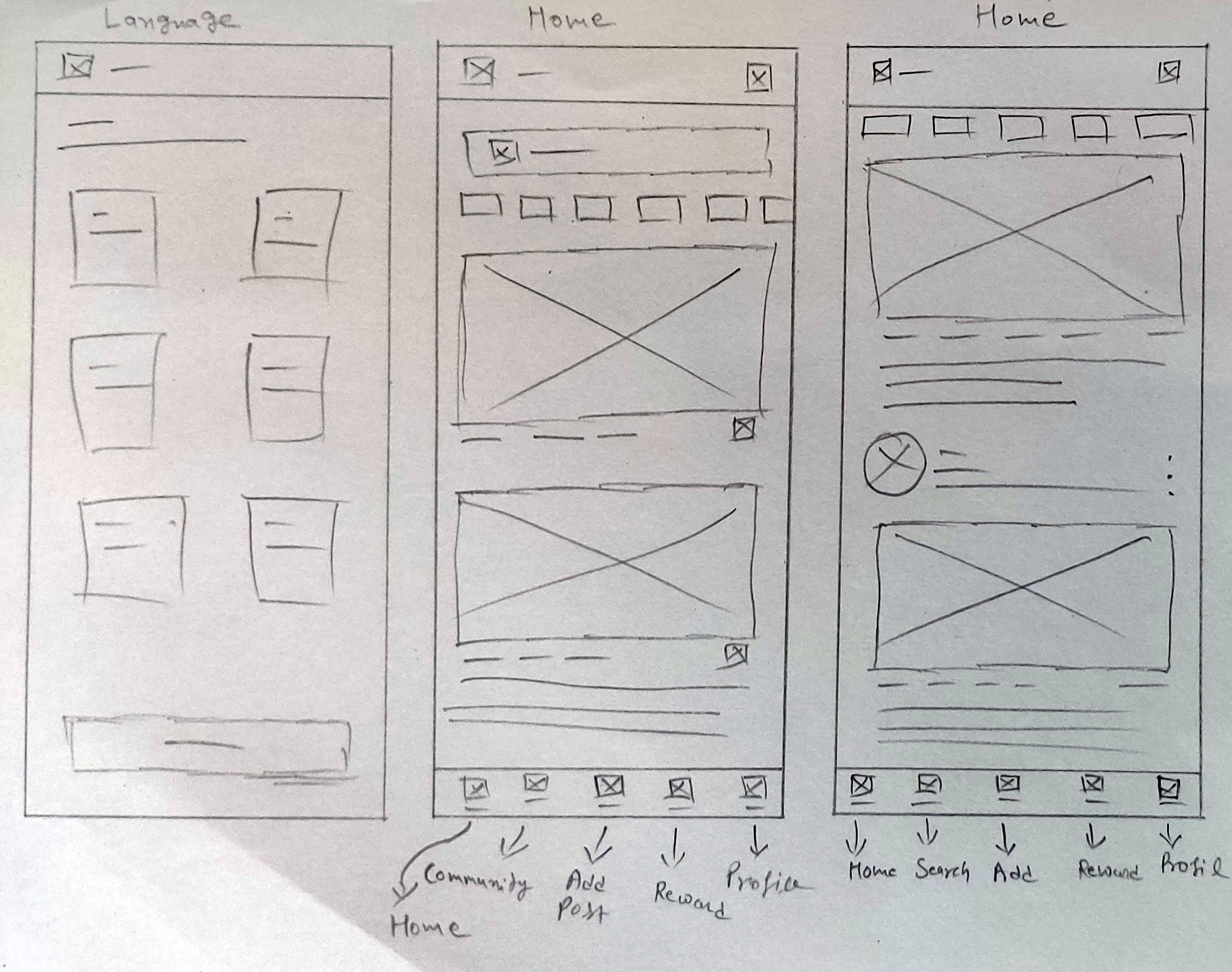
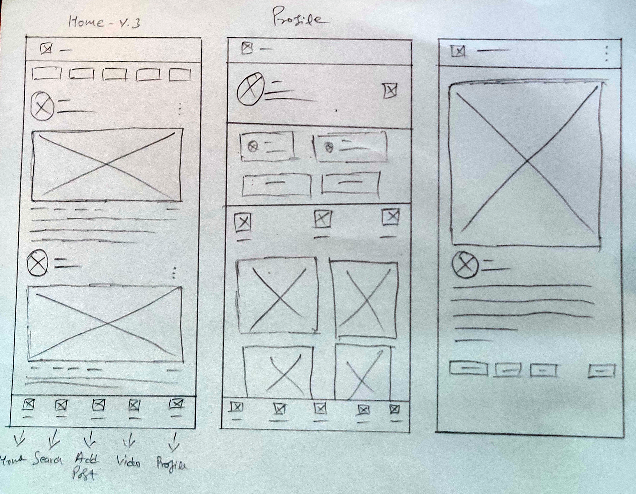
IdeatePaper Wireframe
Post-creation of the UI Requirement Document and a corresponding to-do list for the critical screens identified in the task and user flows, I commenced sketching low-fidelity screens. This quick, hand-drawn approach allows me to explore and refine ideas efficiently before the extensive process of digital rendering.
In UX design, a paper wireframe is a hand-drawn sketch that outlines the basic structure and layout of a user interface (UI). It is a low-fidelity representation used in the early stages of the design process to convey ideas and concepts quickly and clearly without focusing on detailed aesthetics or technical elements.
IdeateDigital Wireframe
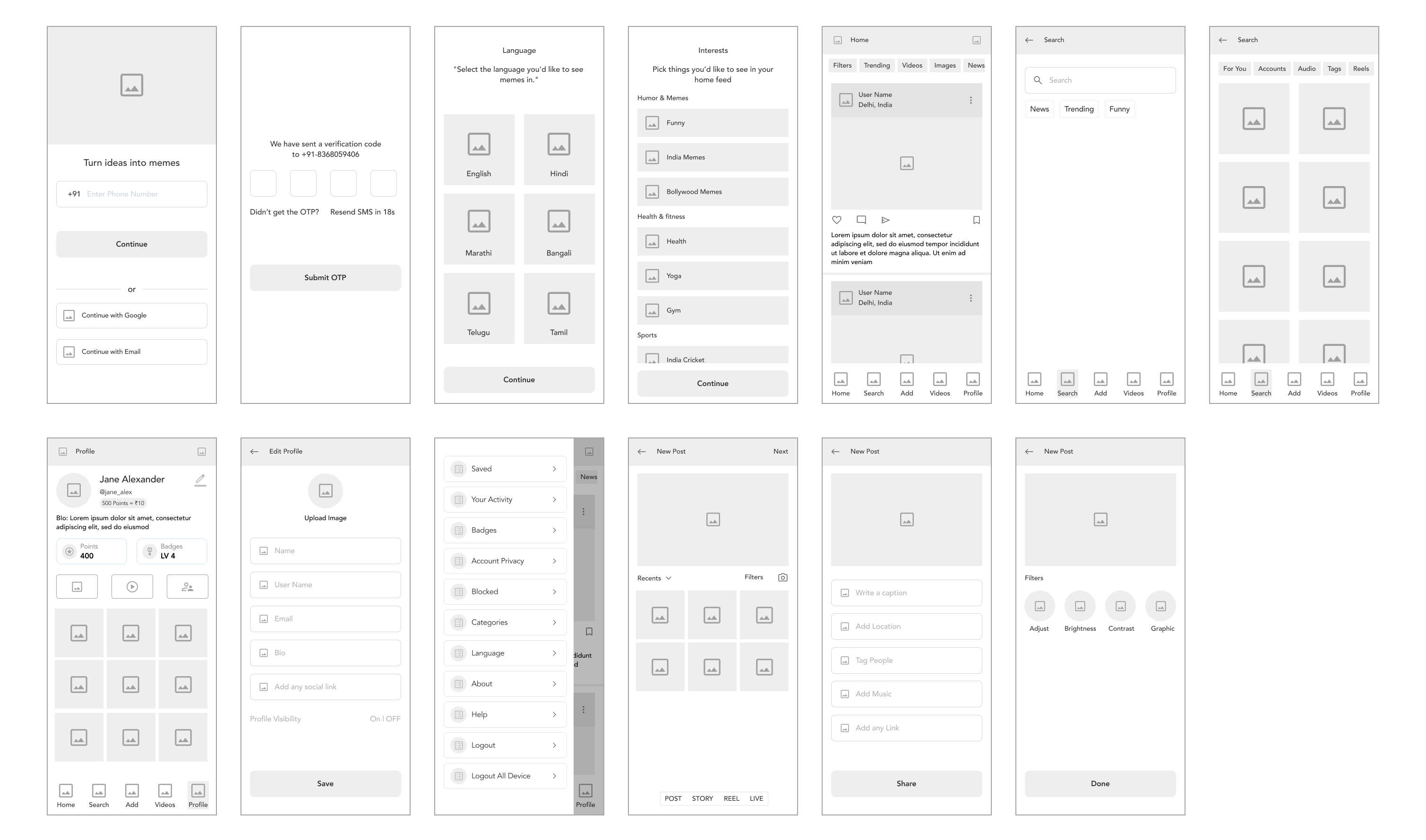
With the visual direction set, I moved on to creating mid-fidelity wireframes to enhance the details and precision of the design. This approach helps maintain visual consistency and hierarchy prior to final styling. I utilized proven design patterns from competitors and incorporated features that directly address user objectives and pain points.
In UX design, a digital wireframe is a visual guide that represents the layout and structure of a user interface. It's a low-fidelity, often grayscale design used to outline the basic elements and functionality of a digital product before adding detailed design elements or high-fidelity visuals.
PrototypeLo-Fi Prototype
Having finalized the essential task screens, I created a Lo-fidelity prototype using Figma to facilitate usability testing. This enables us to detect and address issues with information architecture and user flows before dedicating significant resources to detailed design.
Lo-Fi prototypes are used to quickly sketch out and validate the structure and functionality of a design. They help in testing basic concepts and interactions without investing significant time in detailed design or development.
Prompt - 1
How might we streamline the login and sign-up process to offer multiple, easy-to-use options?
Prompt - 2
How might we improve the search functionality to deliver relevant results quickly and efficiently?
Prompt - 3
How might we simplify profile management and customization features like: Edit, upload image?
Prompt - 4
How might we simplify the creation and uploading processes and speed up content approval?
TestUsability Study
Effective usability testing requires a well-defined Research Plan, including test Project background, participant, Stakeholders profiles, chosen methodologies, KPIs, and scripts. To ensure a comprehensive approach, I have created a usability testing plan that details our testing aims, scope, and preparation strategies.
In UX design, a digital wireframe is a visual guide that represents the layout and structure of a user interface. It's a low-fidelity, often grayscale design used to outline the basic elements and functionality of a digital product before adding detailed design elements or high-fidelity visuals.
Conduct Usability Testing
I performed usability testing with five participants, recording note-taking spreadsheet of their mistakes, observations, Quotes and Task Completion. These note-taking spreadsheet are vital for summarizing user interaction patterns with the prototype.
Usability testing is a crucial part of UX design that involves evaluating a product or system by testing it with real users. The main goal is to identify usability issues, gather qualitative and quantitative data, and understand how users interact with the product to improve its design.
Affinity Diagram
An affinity diagram is a tool used in UX design (and other fields) to organize and categorize a large amount of information, ideas, or data based on their natural relationships. It helps teams synthesize complex information and identify patterns, insights, and themes.
| Patterns | Insights | Recommendations |
|---|---|---|
| Navigation Difficulties: Users, including Participants 1 and 5, had trouble finding key features. | Navigation and Discoverability: Difficulties in locating features highlight the need for improved discoverability and clearer navigation. | Enhance Navigation: Improve feature discoverability with clearer labels, better organization, and accessible design elements. |
| Technical Issues: Participants 2 and 4 experienced errors or unresponsive elements. | Error Handling: Technical issues and unclear error messages directly impact user task completion and overall satisfaction. | Resolve Technical Issues: Address bugs, ensure interactive elements are responsive, and provide clear, actionable error messages. |
| Feature Usability: Participants 2 and 5 struggled with advanced features like filters and music addition. | Usability of Advanced Features: The complexity of using features like filters and music indicates a need for simplification and better guidance. | Simplify Feature Usage: Streamline and simplify processes for applying filters and adding features to enhance usability. |
| Interface Clarity: Participants 1 and 5 were confused about the location and functionality of certain options. | Instructional Clarity: Confusion over instructions and interface elements leads to incomplete tasks and user frustration. | Provide Clear Instructions: Integrate clear, step-by-step instructions and prompts to help users complete tasks correctly. |
| Incomplete Tasks: Participants 2 and 5 missed steps or updates due to unclear instructions or interface issues. | Interface Design: The current design may contribute to user confusion and difficulty in performing tasks efficiently. | Redesign Interface: Revise the interface layout to make it more intuitive, reducing confusion and improving overall user experience. |
Branding
Branding in UX design accessibility involves ensuring that all elements of a brand's identity—visuals, tone, interactions, and emotional connections—are accessible to everyone, including people with disabilities. This approach not only adheres to ethical standards but also expands the brand's reach and inclusivity.
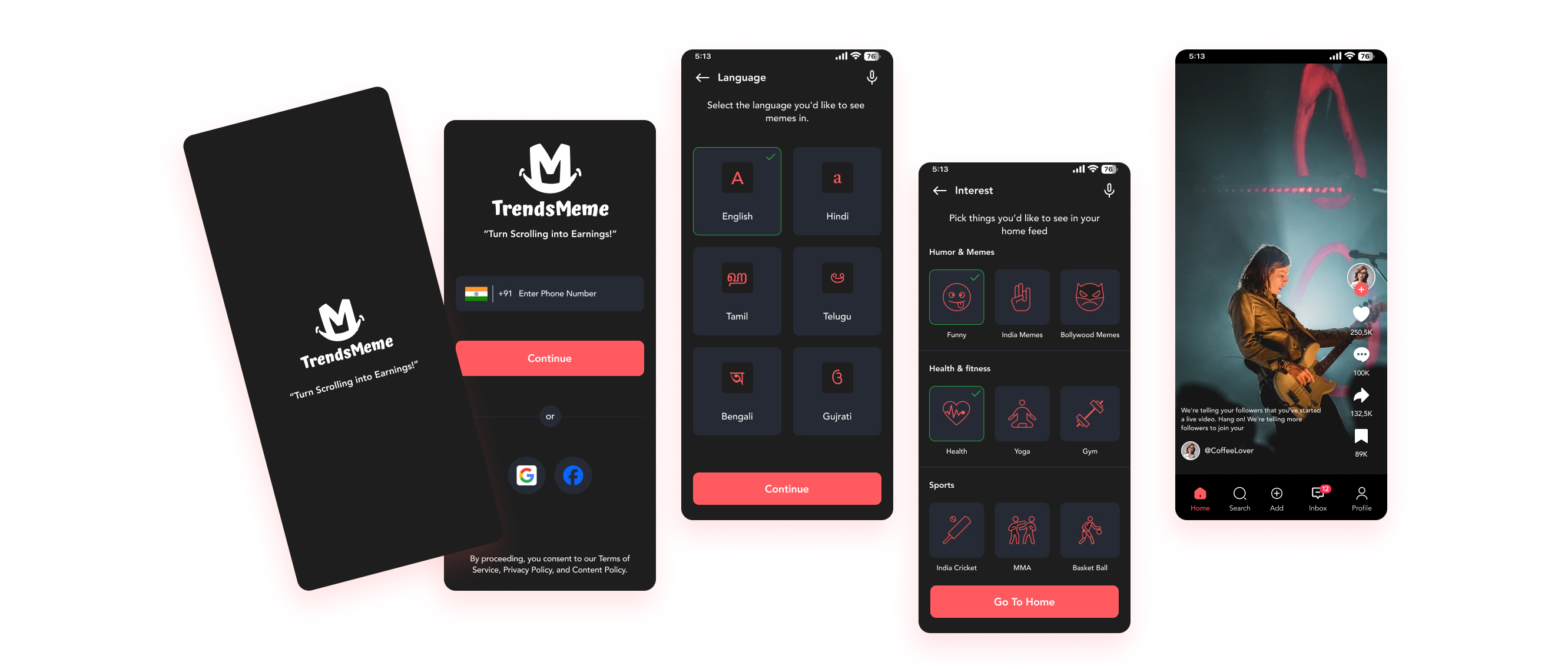
High Fidelity Designs
Branding in UX design accessibility involves ensuring that all elements of a brand's identity—visuals, tone, interactions, and emotional connections—are accessible to everyone, including people with disabilities. This approach not only adheres to ethical standards but also expands the brand's reach and inclusivity.
Final Thought and Next Step
Final Thought
With the final prototype complete, I believe I have successfully met the initial design goals. I developed a mobile app for meme-sharing and creation, featuring tools for discovering and engaging with trending content, along with branding materials that reflect the app's fun and creative spirit. If given more time, I would further develop nice-to-have features to enhance the app's uniqueness and competitive edge.
Next Step
Design Implementation & Handoff
With the meme-sharing and creating app design thoroughly tested and revised, it is now ready for the development phase. To ensure effective communication with developers, I have redlined and organized my design deliverables using Zeplin for handoff and am prepared to assist with any follow-up questions.
Maintenance
Future updates and revisions will be managed based on priority levels to ensure continuous improvement and alignment with user needs.
What i learned
In this project, I conducted user interviews, competitor analysis, created low-fidelity wireframes, linked prototypes, carried out a usability study, and designed high-fidelity UI screens. I gained significant insights and skills, but I recognize there is always room for improvement and further growth in this field.
